Problem
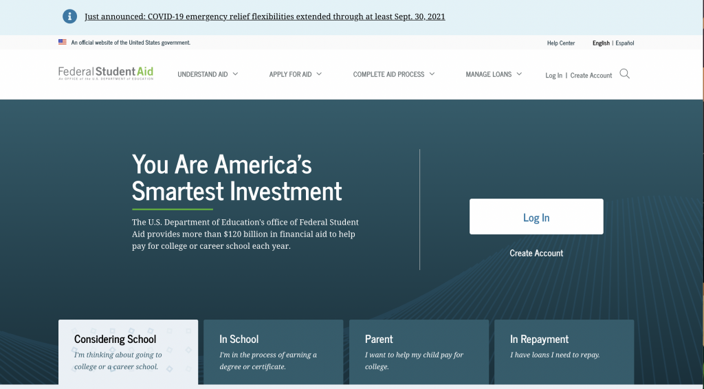
Federal Student Aid, an office of the Department of Education, manages StudentAid.gov, the main website that supports Title IX higher education funding in the country. One of the most visited federal government sites, StudentAid.gov handles more than 20 million FAFSA (Free Application for Federal Student Aid) submissions per year, and supports other relevant tasks like a personalized dashboard with student’s aid summary, digital, self-paced counseling for student loans, and applications for income-driven repayment plans.
Approach
This was the first top-task usability test to be conducted on the production site. Various individual products and features on StudentAid.gov have been usability tested independently, either during design sprints or after release. This was an opportunity to take a holistic view of the site and incorporate more content-based pages.
Our goals were to:
- Evaluate 10 common tasks and scenarios with users
- Uncover any navigation pain points and unexpected issues
- Test on both desktop and mobile devices
- Evaluate the site’s content in context with top tasks on content pages
We tested with a diversity of students, parents, and student loan borrowers in repayment with different incomes, ethnicities, and geographic location across the U.S.
Results
Key Takeaways

- Most users don’t associate Federal Student Aid with the FAFSA. The term FAFSA has much stronger household recognition than Federal Student Aid, despite Federal Student Aid’s efforts to consolidate most of its program sites into one website.
- The site’s main mega-menu on desktops has room for improvement. A lot of users misunderstood categories such as “Manage Loans” which users thought was more personalized to them.
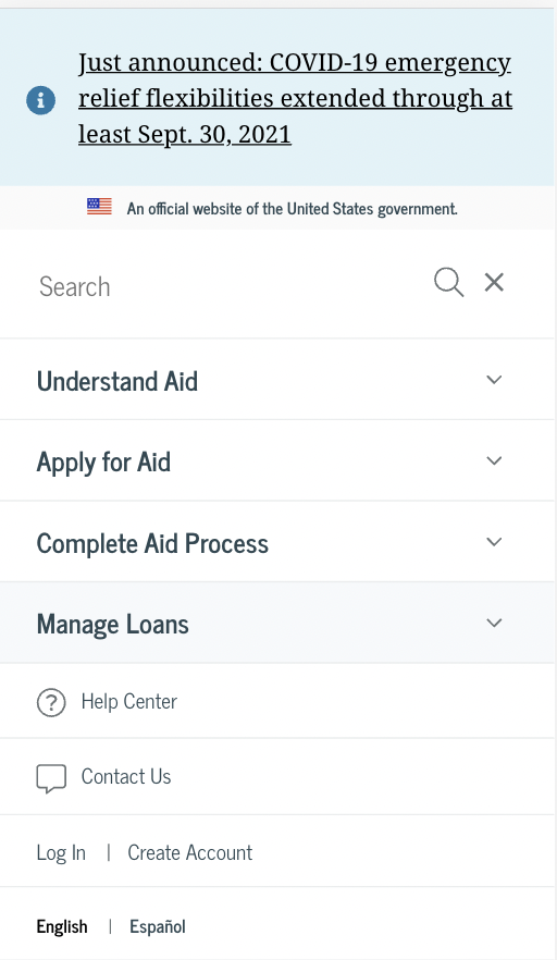
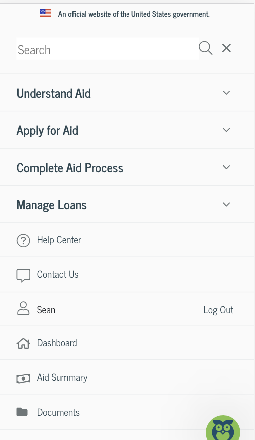
- When users log in, there is a utility menu that appears. Many users didn’t notice it since it was not prominent in the main navigation area and on mobile, it appears below other sections within the navigation.
- Long content pages meant users often hunted and pecked for information, resulting in longer than expected time on task metrics. Very few users used the site search, despite its prominence.
- The mobile website’s navigation proved difficult for users. Many felt the menu was overwhelming and they couldn’t easy find the logged-in pages, such as Dashboard, My Aid, My Docs, and Settings.
Key Recommendations

- Continue mobile testing as part of a core user research approach
- Redesign the in-page navigation for content pages to better support anchor/jump links within the page and to provide mobile users a better experience
- Improve the mobile website’s navigation and consider how the logged-in links interact with the main site’s navigation. Consider a robust, secondary navigation on logged-in pages.
- Conduct a card sort on the site’s main topics to evaluate the site’s information architecture and navigation schemes. Consider condensing the amount of links in the site’s main navigation.
Lessons learned
- Remote testing with mobile devices proved easier than anticipated. Using Microsoft Teams, we were able to easily have participants share their phone screens
- Top-task testing, outside of feature-based testing, is a helpful activity and should be part of any evaluate user research approach. Developing a cadence for this type of testing insures a regular interval for continuous improvement discovery
