Usability testing is one of the most useful tools to uncover how well a website is supporting users’ main goals and tasks. Testing can occur anytime during a development of a new system, but it also can be used to discover how well a system is performing; this is often called benchmark usability testing. For the purposes of this testing, we conducted a nano usability test with three users of Marriot.com using the production live website.
Our nano usability test is a great first start to evaluating how well Marriott’s online booking system is working for users. Testing helps to uncover usage patterns, challenges encountered by users, as well as additional research questions. The purpose of testing is to not walk away knowing how to fix every issue with the system. Rather, it’s a first step to understanding where improvements might be made within the online booking system.
To kick things off, we generated three major tasks and recruited three participants.
Task completion
Overall, participants performed well. Only participant 2 had trouble understanding the larger concept of Marriott.com offering different hotel brands within the same booking experience. Users commented that the process felt “easy, and relatively quick” given two users knew a destination and dates they desired. Two out of three commented that they most likely would first compare prices with another travel website like Kayak or Priceline before purchasing.
| Task | Participant 1 | Participant 2 | Participant 3 |
| Select destination, date and details | Completed | Completed | Completed with difficulty |
| Select hotel | Completed | Completed | Completed |
| Select room | Completed | Completed | Completed with difficulty |
Participant 1: Had very little trouble picking a destination and dates from the main homepage. On the results page, they noted they liked how different hotel chains within the Marriott brand were displayed, but they couldn’t find a way to sort by price, a filtering option they often like to use. On the room selection page for the Park Central Hotel in San Francisco, they said they liked the different price options, and the prepay and save would be a feature they’d use. Often, they would pick the cheapest room option.
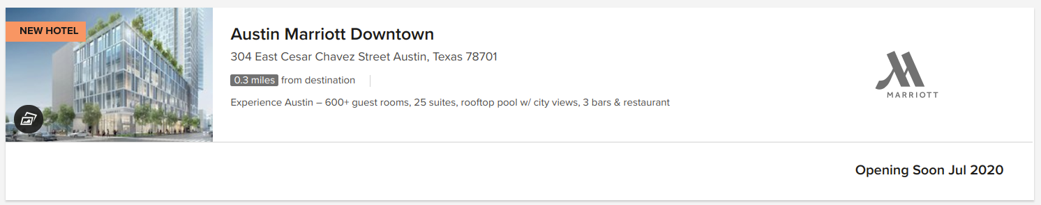
Participant 2: This user was using a smaller laptop and didn’t initially see the homepage call to action booking feature. They selected “Find and Reserve” which dropped down the same selections to pick a destination and date. Once they searched for Austin, Texas, on the results page, the user was briefly confused as why there were multiple hotel brands displayed. “I guess Marriott must own them,” the user questioned. Another thing the user noted on, was why the the results list showed hotels not available on the dates selected. They noticed a checkbox that filters to hotels available, but was confused why that wasn’t the default option. They selected a downtown Austin hotel and selected a prepay room; although commented on how long the title of the room was.
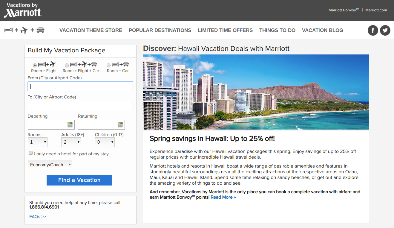
Participant 3: This user didn’t have a destination in mind, so they selected the Deals and Packages page, and selected the Hawaii vacations link. The system sent the user to the vacations by marriott site, a separate site with a different booking experience. On this page, featured hotels were listed but with no price. The user selected the first option, then was prompted to input a date and departure city. Once the list of results was returned, the user selected the first option for the king room. While they successfully booked a room, albeit through the vacations website, they did ask “Am I on the right site? Did I do this right?”
Main findings: user challenges
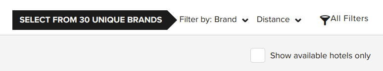
- Finding an option to sort by price was difficult
- Participant 1 had difficulty finding an option to sort the list of hotels by price, which doesn’t appear to be an option within the results page. Sorting by price is a common organization scheme that most travel sites offer. On the results page, the default scheme is to sort by distance.
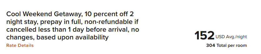
- Deciding on a room type took special care, since the room’s titles are often long
- While choice is often good for users, too much can overwhelm them. In this case, selecting a room at a particular hotel was somewhat difficult. This was due to the fact that hotel rooms have long titles, with a strong font that makes it difficult to read. This can increase users cognitive load and easily lead to frustrations. One room for a Courtyard Marriott was titled, “Cool Weekend Getaway, 10 percent off 2 night stay, prepay in full, non-refundable if cancelled less than 1 day before arrival, no changes, based upon availability” in a large, bold font.
- The Marriott vacations experience is completely separate from the main Marriott.com booking experience
- One user that didn’t have a destination in mind selected the deals section of the website. After browsing about Hawaii, they were taken to the Marriott Vacation website, a separate experience that had a different look and feel. This separate site may confused users and there wasn’t any indication that you were leaving the main Marriott site.
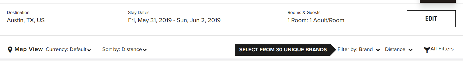
- The hotel results list often included hotels not available or coming soon
- Even though a user selected dates for a trip, the results page often displayed hotels that were not available or “opening soon.” The option to display only available hotels was not selected by default. Showing all hotels in the list may be helpful for someone that is browsing, but could be frustrating to someone that knows the dates they want to travel. More results in the list means more items users have to scan through, which can increase cognitive load.
Additional user research questions
Our test stopped at the payment section and was narrowly focused only on the booking process. Since we were running a quick nano usability test, we didn’t have time to prepare fake information to use in the payment step. However, this is a critical step that deserves to be tested in the future. In addition, further research questions may surround:
- What additional challenges are encountered by user attempting common tasks on Marriott.com? Tasks could include:
- Changing or canceling a reservation
- Signing up for loyalty program/credit card
- Contacting customer service
- What substantial usability impediments exist? (items that may influence a user to abandon the website or booking process)
- What are additional customer insights that may help Marriott’s digital strategy?
One of the most important next steps is to ensure Marriott’s website has clearly identified and measurable goals. Understanding Marriott’s goals and business strategies will help determine research activities to further improve Marriott’s digital products.
Conclusion
Conducting user research helps designers conceptualize systems and processes that match how users think. Designing an experience that just plain works well doesn’t happen with luck. Through proven research methods and user engagement, organizations can build products with users, rather than “for” users. Involving users in prototyping, development, and testing, is a necessary step that helps give a product a higher chance of success.
As demonstrated with the nano usability test, research doesn’t have to be a long, drawn-out process. With only three users, we were able to quickly identify areas of the booking process to explore. This quick testing method gave us insights that we didn’t have before. Testing often allows a continuous check-in on how a design is performing and gives organizations insights into how to improve their products. Research is a great way to ensure designs match user expectations. Any form of research, big or small, assists with improving the user experience for users and helps to align digital products with the goals of an organization.