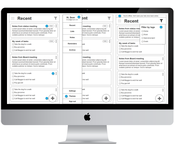
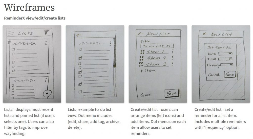
Public libraries serve an important community role. Having a website and services that work well for people helps libraries meet their missions. I researched how users want to use a library website and generated ideas and recommendations on how to improve a local library site.
The Problem
As it was understood, the current Billings Public Library’s website had grown over the years and information became increasingly difficult to find. The site’s organization schemes and structures didn’t appear to be working and wasn’t supporting users’ key tasks. With focused research, iterative design and clear communication, we’ve developed research and design artifacts that will help improve the site and focus it more on users’ main goals.
This project was for a graduate school assignment.
Approach
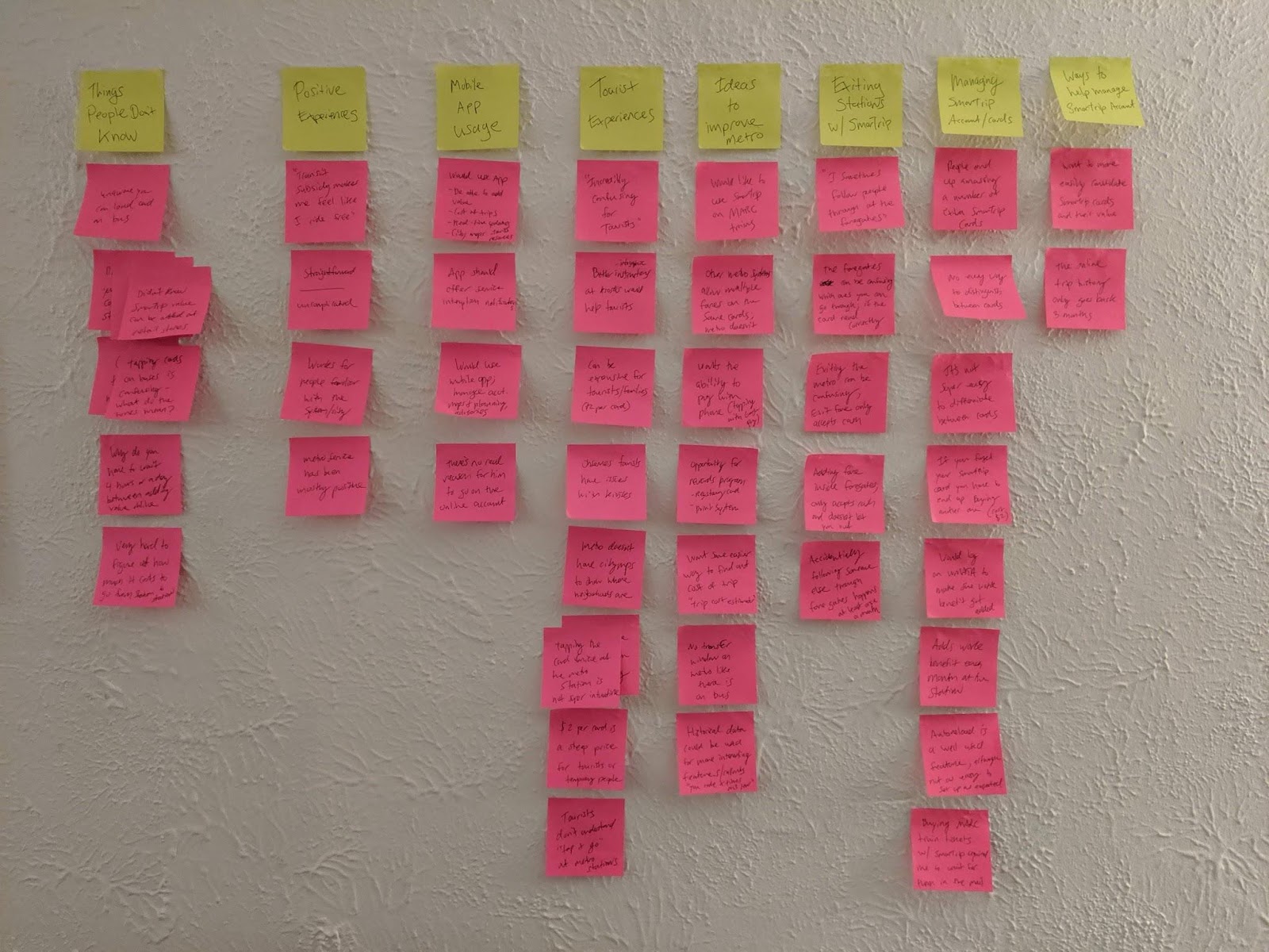
Conversations were held with librarians at the downtown branch of the Washington, D.C. Public Library. User interviews helped determine target users and their behaviors, patterns, and goals.
Our research goals were to:
- Identify target users
- Learn about users goals and top tasks on library websites
- Understand user challenges or limitations
- Identify any content holes or enhancements to the site
In addition to interviews, we conducted research into other library websites, industry research around best practices and common uses, and UX case studies on library website projects.
Results
What we learned about users
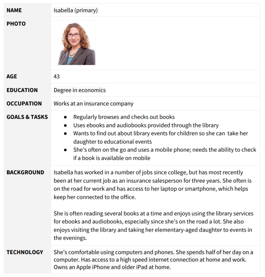
Library websites are used by a variety of audiences, and our four personas describe likely library site users. (see detailed personas on the next page)
- Isabella the mother who leads a busy life but enjoys reading and listening to audiobooks.
- Wayne the retiree who uses the library as a community meeting space.
- Lisa the student who likes to read and use library computers to do homework.
- Martin the new resident that wants to learn about the local library.
What users want to do
Based on our research, users top priority tasks are to:
- Browse or find a book
- Place a hold on a book
- Find an ebook or audiobook
Following the primary tasks, the site needs to easily support users that want to:
- Reserve a conference room
- FInd out when the library is open
- Find out how to get a library card
- FInd out about events
- Look up a specific class offering
- Find out information about volunteering
Task priority: by primary and secondary personas
| Isabella (P) | Wayne (P) | Lisa (S) | Martín (S) | |
| High Priority Tasks | ||||
| Browse or find a book | Yes | Yes | Yes | |
| Place a hold on a book | Yes | Yes | ||
| Find an ebook or audiobook | Yes | Yes | Yes | Yes |
| Medium Priority | ||||
| Reserve a conference room | Yes | Yes | ||
| FInd out when the library is open | Yes | Yes | Yes | |
| Find out how to get a library card | Yes | Yes | ||
| FInd out about events | Yes | Yes | ||
| Low Priority | ||||
| Look up a specific class offering | Yes | |||
| Find out information about volunteering | Yes |
recommendations
There are a number of ways to organize and classify information on a website. In the case of the Billings Library, using an ambiguous organizational scheme with both audience and topical schemes will support users in finding key information and offer a simple way to navigate through the website.
Considering the current site uses an audience scheme to segment certain content for seniors, adults, teens, and children, continuing an audience based scheme works because content is very audience specific. However, we’ll combine Teens & Children and Adults & Seniors into two groups.
The rest of the information on the site fits nicely into a topic-based scheme, based on several key categories. The proposed main categories for the Billings Public Library navigation:
- My Account
- Digital Services
- Job Training & Education
- Library Services
- Research
- About
- For Kids & Teens
- For Adults & Seniors
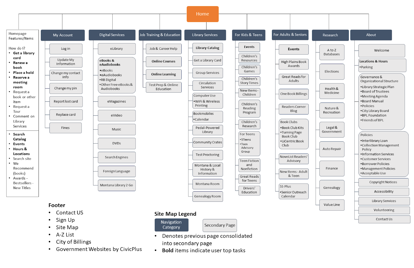
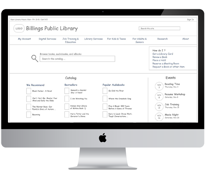
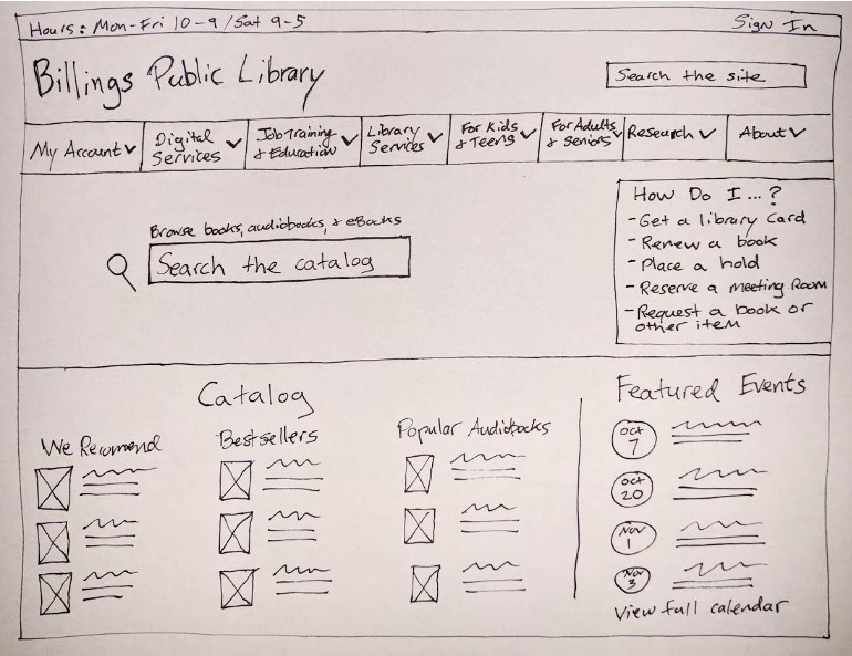
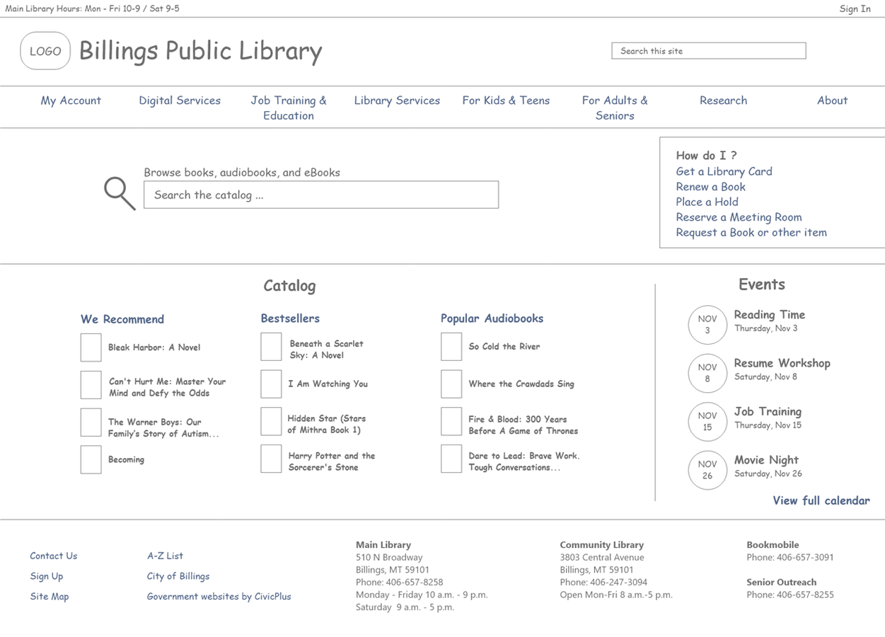
Homepage Features
In addition to the new navigation, enhancements to the homepage will help promote the site’s primary tasks discovered during research.
- “How do I feature,” which lists common how-to tasks (get a card, renew a book, etc.)
- Hours and Locations
- Browse the catalog
- Site search
- Events
- Featured books (We Recommend, Awards, Bestsellers, New Titles
Lessons learned
- The value of content audits can not be overstated. They help you identify what types of content you currently have on your site and can help reduce the content on your site.
- Complex site maps can be difficult to make but are an important artifact to communicate your site’s information architecture to key stakeholders.