Category: design
Categories
Policy Infographics
Helping to make sense of complex student loan policies.
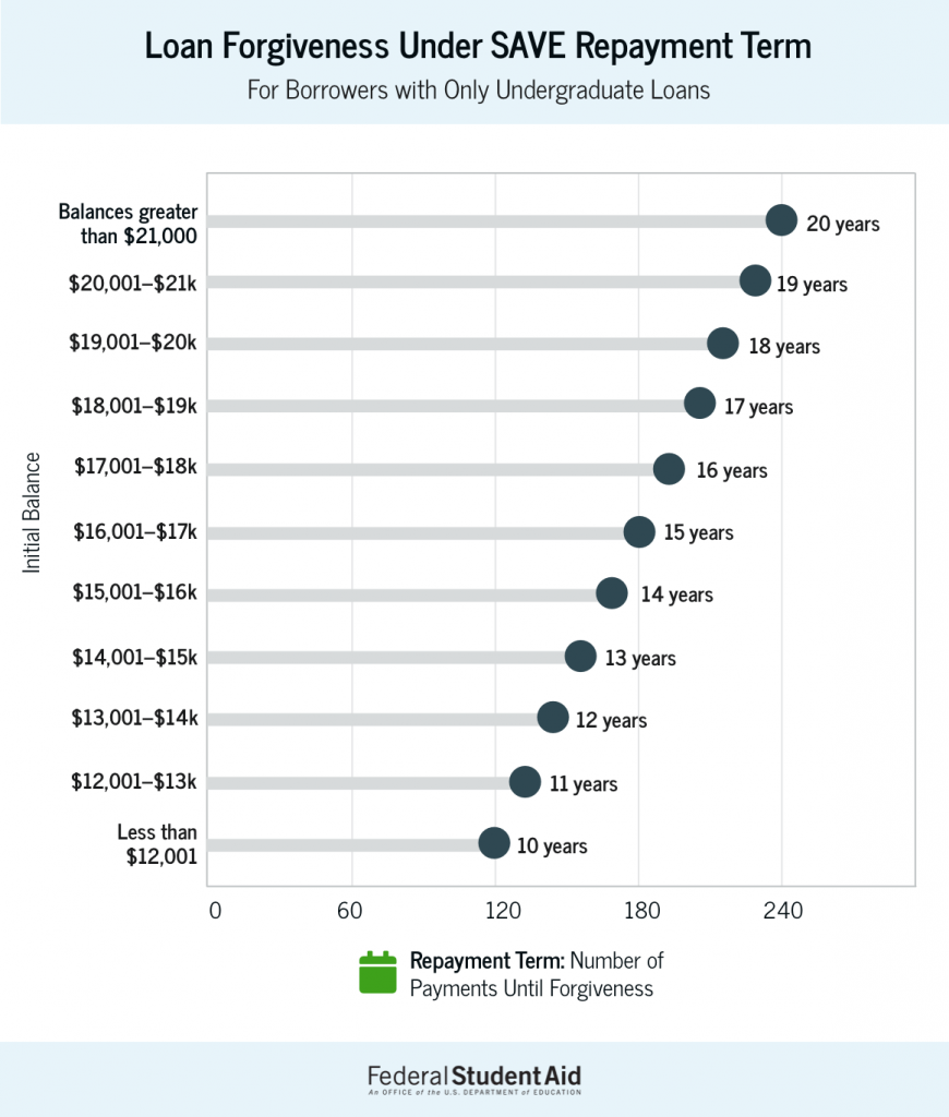
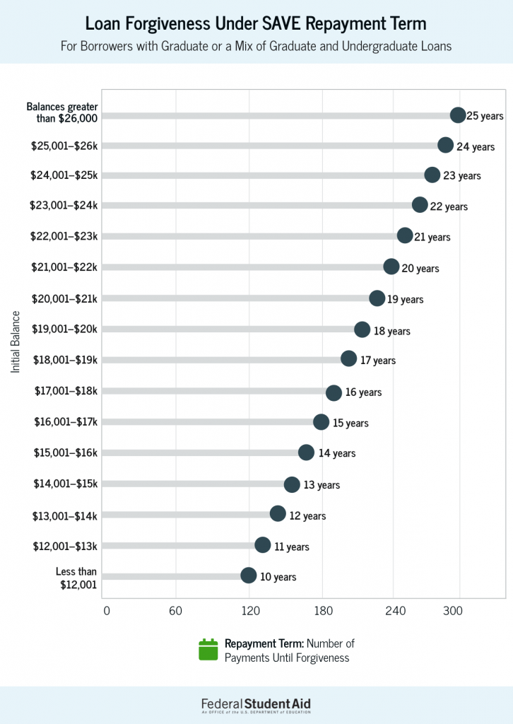
Saving on a Valuable Education (SAVE) Repayment Plan
Student loan borrowers as part of the SAVE plan may be eligible for early forgiveness of their loans. In this graphic, I designed a quick way for student loan borrowers to understand how the policy may affect their early forgiveness amount.
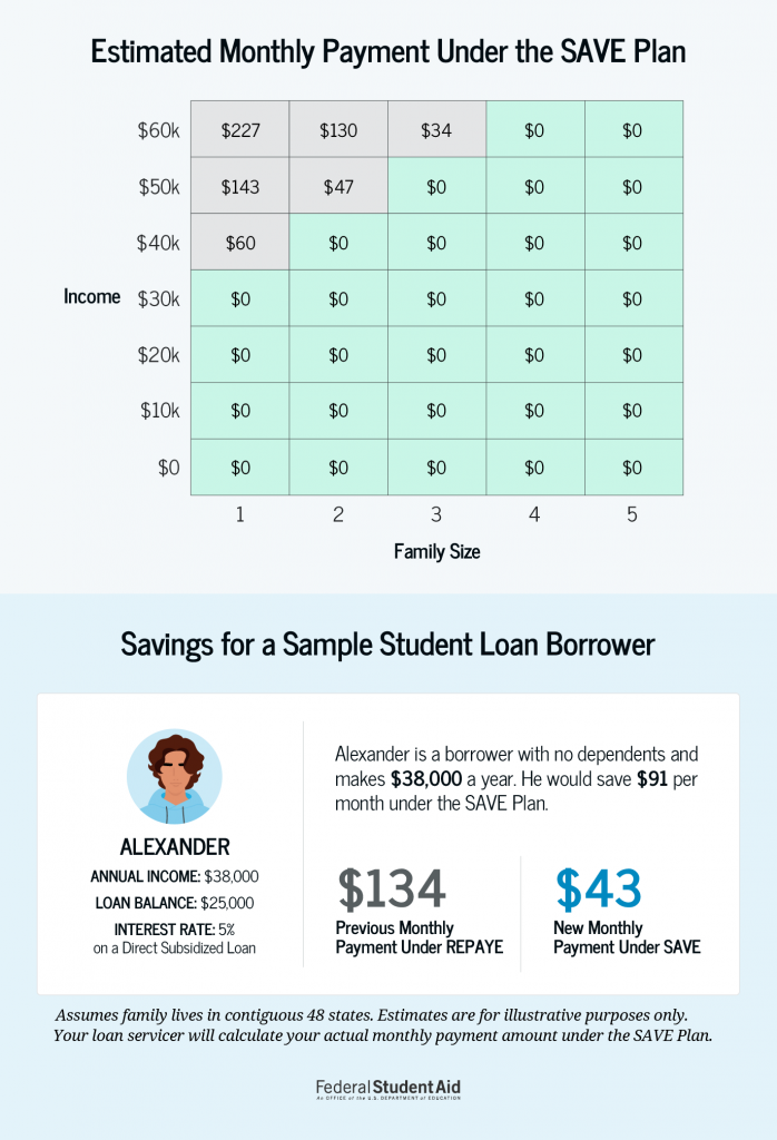
SAVE Repayment Amounts based on Income and Family Size
In this infographic, I developed a way for student loan borrowers to quickly determine where they fall in terms of monthly payment. Under the income-driven repayment plan, you pay you can now buy back certain months in your payment history to make them qualifying payments for PSLF. Specifically, you can buy back months that don’t count as qualifying payments because you were in an ineligible deferment or forbearance status.
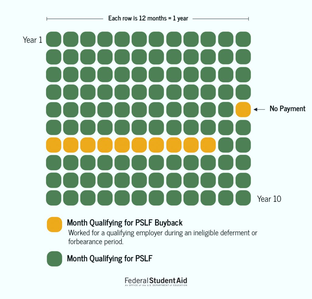
Public Service Loan Forgiveness (PSLF)
Under the 10-year public service forgiveness program, a student loan borrower can buy back certain months in their payment history to make them qualifying payments for PSLF. Specifically, you can buy back months that don’t count as qualifying payments because you were in an ineligible deferment or forbearance status. In order to help illustrate that, I created this graphic for the information page on studentaid.gov.
This website project was part of a grant with a team of five faculty members at James Madison University with a goal of educating the community on health policy. The goal of the initiative is to educate the community about JMU’s health-related civic engagement in the community and the world.
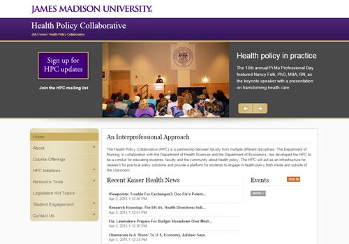
The Problem
As the lead project designer, I worked with various stakeholders to conduct information gathering sessions. While a relatively new initiative from James Madison University — the Health Policy Collaborative had little visibility and lacked a dedicated website.
Approach
I conducted research which included meeting with faculty, nurse practitioners, state policy experts, and local politicians. These meetings and interviews helped get a sense of what the newly formed group, the Health Policy Collaborative, would want to showcase on the website and how the general public would receive the information.
We learned users’s top tasks and goals as well as clear goals from our stakeholders.
Results
After identifying target audiences and developing user personas, I explored an information organization activity, attempting to piece together the various themes and information needs of the site.
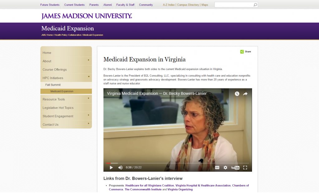
Working inside the JMU content management system was limiting, but we were able to do certain things on the site, like pull in outside news sources. I led an effort to include an interview I conducted with a health policy expert on Medicaid expansion in Virginia.
This relatively short project meant the site’s needs were going to change in the future. My goal for this group was to create them a foundation website, that presented their information clearly and professionally.
This meant creating a information architecture framework that could grow, and not impact the discoverability factor for users.
Considering JMU’s site wasn’t responsive at the time, performance and usability on a phone or tablet still remains an issue.
Lessons learned
- Logistics of scheduling interviews with stakeholders can prolong the time necessary to get information critical for a website.
- Content management systems (CMSs) often have limitations and it’s important to understand the technology behind it in order to not waste time designing something you know will not work.
Public libraries serve an important community role. Having a website and services that work well for people helps libraries meet their missions. I researched how users want to use a library website and generated ideas and recommendations on how to improve a local library site.
The Problem
As it was understood, the current Billings Public Library’s website had grown over the years and information became increasingly difficult to find. The site’s organization schemes and structures didn’t appear to be working and wasn’t supporting users’ key tasks. With focused research, iterative design and clear communication, we’ve developed research and design artifacts that will help improve the site and focus it more on users’ main goals.
This project was for a graduate school assignment.
Approach
Conversations were held with librarians at the downtown branch of the Washington, D.C. Public Library. User interviews helped determine target users and their behaviors, patterns, and goals.
Our research goals were to:
- Identify target users
- Learn about users goals and top tasks on library websites
- Understand user challenges or limitations
- Identify any content holes or enhancements to the site
In addition to interviews, we conducted research into other library websites, industry research around best practices and common uses, and UX case studies on library website projects.
Results
What we learned about users
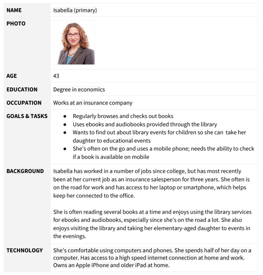
Library websites are used by a variety of audiences, and our four personas describe likely library site users. (see detailed personas on the next page)
- Isabella the mother who leads a busy life but enjoys reading and listening to audiobooks.
- Wayne the retiree who uses the library as a community meeting space.
- Lisa the student who likes to read and use library computers to do homework.
- Martin the new resident that wants to learn about the local library.
What users want to do
Based on our research, users top priority tasks are to:
- Browse or find a book
- Place a hold on a book
- Find an ebook or audiobook
Following the primary tasks, the site needs to easily support users that want to:
- Reserve a conference room
- FInd out when the library is open
- Find out how to get a library card
- FInd out about events
- Look up a specific class offering
- Find out information about volunteering
Task priority: by primary and secondary personas
| Isabella (P) | Wayne (P) | Lisa (S) | Martín (S) | |
| High Priority Tasks | ||||
| Browse or find a book | Yes | Yes | Yes | |
| Place a hold on a book | Yes | Yes | ||
| Find an ebook or audiobook | Yes | Yes | Yes | Yes |
| Medium Priority | ||||
| Reserve a conference room | Yes | Yes | ||
| FInd out when the library is open | Yes | Yes | Yes | |
| Find out how to get a library card | Yes | Yes | ||
| FInd out about events | Yes | Yes | ||
| Low Priority | ||||
| Look up a specific class offering | Yes | |||
| Find out information about volunteering | Yes |
recommendations
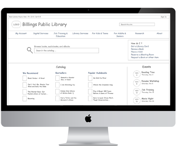
There are a number of ways to organize and classify information on a website. In the case of the Billings Library, using an ambiguous organizational scheme with both audience and topical schemes will support users in finding key information and offer a simple way to navigate through the website.
Considering the current site uses an audience scheme to segment certain content for seniors, adults, teens, and children, continuing an audience based scheme works because content is very audience specific. However, we’ll combine Teens & Children and Adults & Seniors into two groups.
The rest of the information on the site fits nicely into a topic-based scheme, based on several key categories. The proposed main categories for the Billings Public Library navigation:
- My Account
- Digital Services
- Job Training & Education
- Library Services
- Research
- About
- For Kids & Teens
- For Adults & Seniors
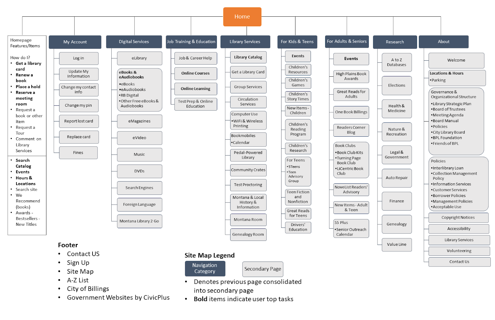
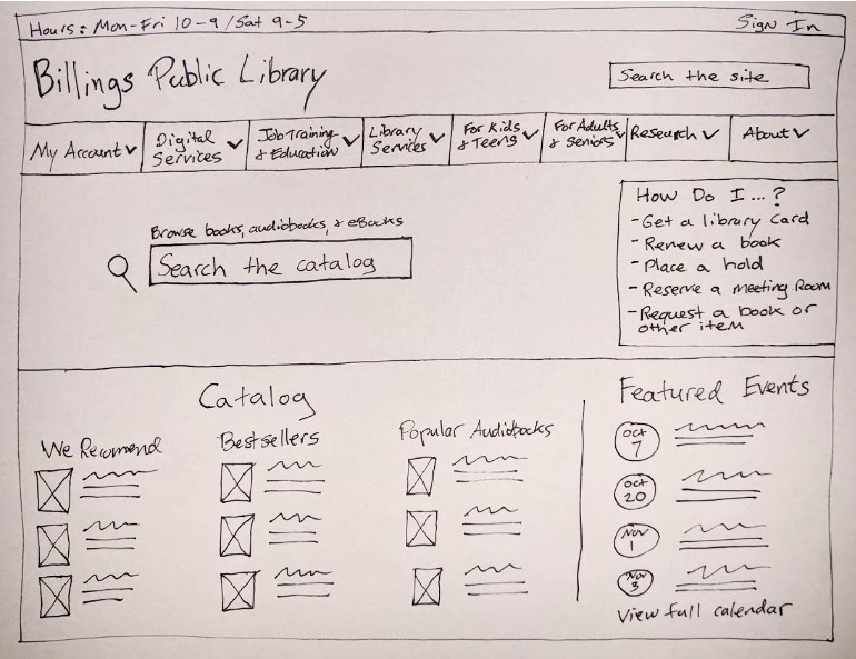
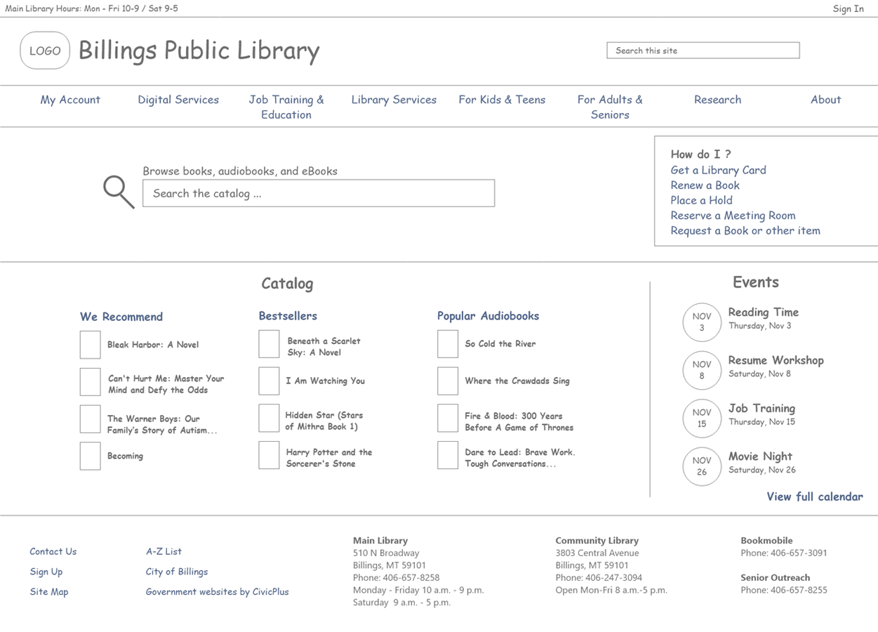
Homepage Features
In addition to the new navigation, enhancements to the homepage will help promote the site’s primary tasks discovered during research.
- “How do I feature,” which lists common how-to tasks (get a card, renew a book, etc.)
- Hours and Locations
- Browse the catalog
- Site search
- Events
- Featured books (We Recommend, Awards, Bestsellers, New Titles
Lessons learned
- The value of content audits can not be overstated. They help you identify what types of content you currently have on your site and can help reduce the content on your site.
- Complex site maps can be difficult to make but are an important artifact to communicate your site’s information architecture to key stakeholders.
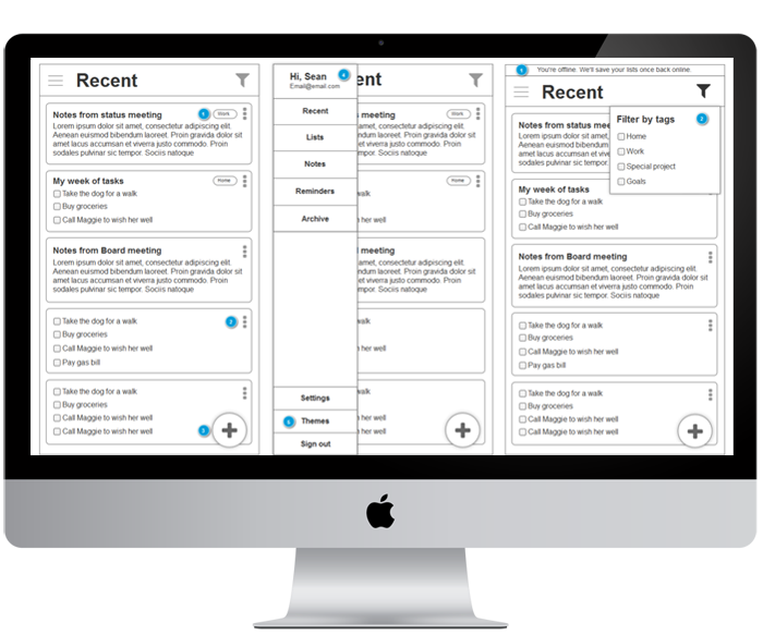
I was given the opportunity to research and design improvements to a organization-type app that focused on reminders. Using UX research methods and design iteration, I helped to re-think the direction for the app.
The Problem
The ReminderX mobile app was in need of a re-think. The clients wanted to find out what direction the app should take, and ways it can be improved. My role was to help build out a road map for the app based on research. From there, I was tasked with re-designing the app.
Approach
Conversations were held with four separate participants. User interviews helped determine target users and their behaviors, patterns, and goals.
Research areas explored:
- Identifying digital tool (reminder apps, calendars, etc.) usage by participants
- Understanding behaviors of participants in relation to creating lists and setting reminders (note-taking, digital apps, etc.)
- Understanding challenges or limitations of current processes
Additionally, participants offered feedback on the ReminderX app, which helped identify future enhancements and improvements help increase the overall user experience and adoption.
Results
Analysis of the research helped identify findings and recommendations for ReminderX. Based on research, a user persona was developed to help the design process. Additionally, I created design tenets, or guiding principles for the app.
- Keep onboarding simple – many users are currently using Google apps that offer lists or event reminders, which don’t require additional logins or accounts. Where possible, leverage other app’s logins (Google or Facebook) for ReminderX. In general, keep the signup process simple.
- Make information accessible – users expect their information to be stored and saved on the cloud where it’s easily accessed from device to device.
- Allow collaboration to encourage adoption – in the professional world, team’s need to share information effectively, and this includes tasks and reminders for team projects or related disciplines. The app should offer sharing or collaboration features.
- Keep to-do lists flexible – users have a variety of needs when it comes to list types. Certain lists are for short-term related tasks or reminders, like grocery lists, to longer term lists of personal or work-related goals. Additionally, users may just want to create a simple note to jot down ideas. Categories or labels may be important for users to organize lists.
- Think post-it notes – emulate the positive experience people feel while checking off an item on their handwritten lists.
- Allow users to declutter lists – people often make many notes and lists throughout the week, and allowing them to easily organize them is paramount. Archiving of old information should be considered.
- Consider offline use – many users are creating lists for shopping. Lists should be cached or locally saved in the app so in the event of poor reception, lists still load in a store.
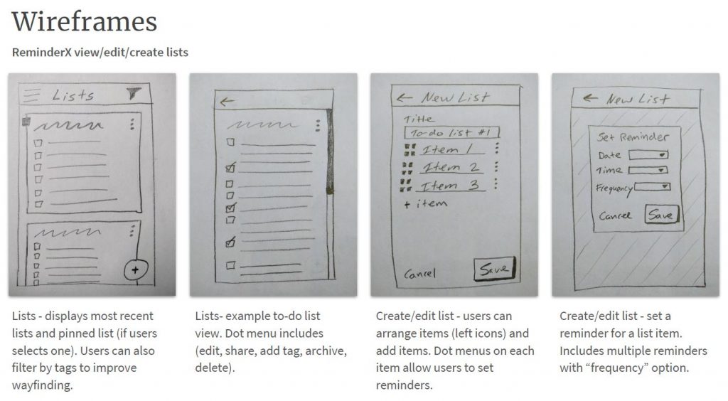
Design and interaction
Using the research findings as a foundation, I started to sketch new ideas about the app’s workflows and task flows. I iterated these sketches and concepts into digital wireframes. From there, I passed the designs along to the development team to build.
Lessons Learned
Sketching can be a really effective method for iterating ideas. It allowed me to not be too worried about how the design actually looked. Instead, sketching kept me focused on the workflows and overall larger picture.