I worked as the UX design lead for the Student Loan Debt Relief project at the U.S. Department of Education’s office of Federal Student Aid.
Problem
The U.S. Department of Education wanted to implement a broad student loan forgiveness program for most student loan borrowers. Borrowers under the 120k income threshold would receive up to $10,000 in forgiveness and some borrowers who had received a Pell grant would get $20,000. We had less than 3 months to design, develop, test and launch an application for 30+ million student loan borrowers.
Approach
Our goals were to:
- Make the form as usable and accessible as possible to maximize forgiveness opportunities for borrowers
- Minimize burden on the public by having to document income
- Move quick to implement an entire forgiveness program within 3 months
- Ensure the system can handle the volume and built trust with the public
We knew we needed to develop a simple application and form but were nervous about the tremendous amount of traffic from people applying for forgiveness. It was decided the form would be available to unauthenticated users and our back-end systems would match personal identifiers in the application to a borrower’s loan records. Due to time constraints and reducing the burden on borrowers to provide income documentation, it was decided to build an “attestation” form, basically a form where you are agreeing you make under a certain income threshold. Then on the backend, a predictive model would flag certain borrowers who would need to provide additional income verification to reduce fraud.
Starting off with Legalize
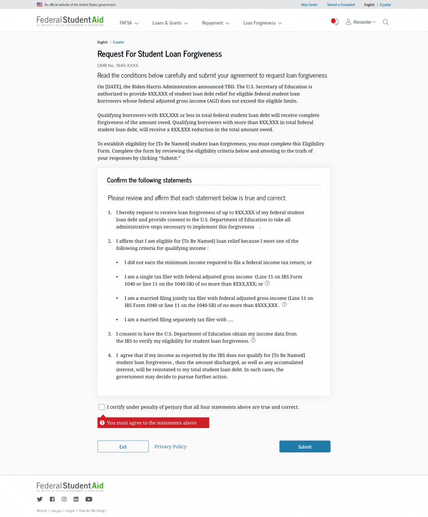
As with government forms, our initial concept was a 2-page form but loaded with dense text that our team were told was necessary to include.
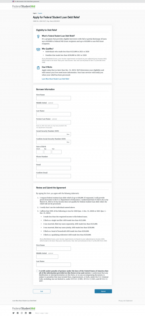
Realizing the form’s rather simple logic, we worked to refine the design and worked with our policy team to reduce text where we could.
Usability Testing Before Launch
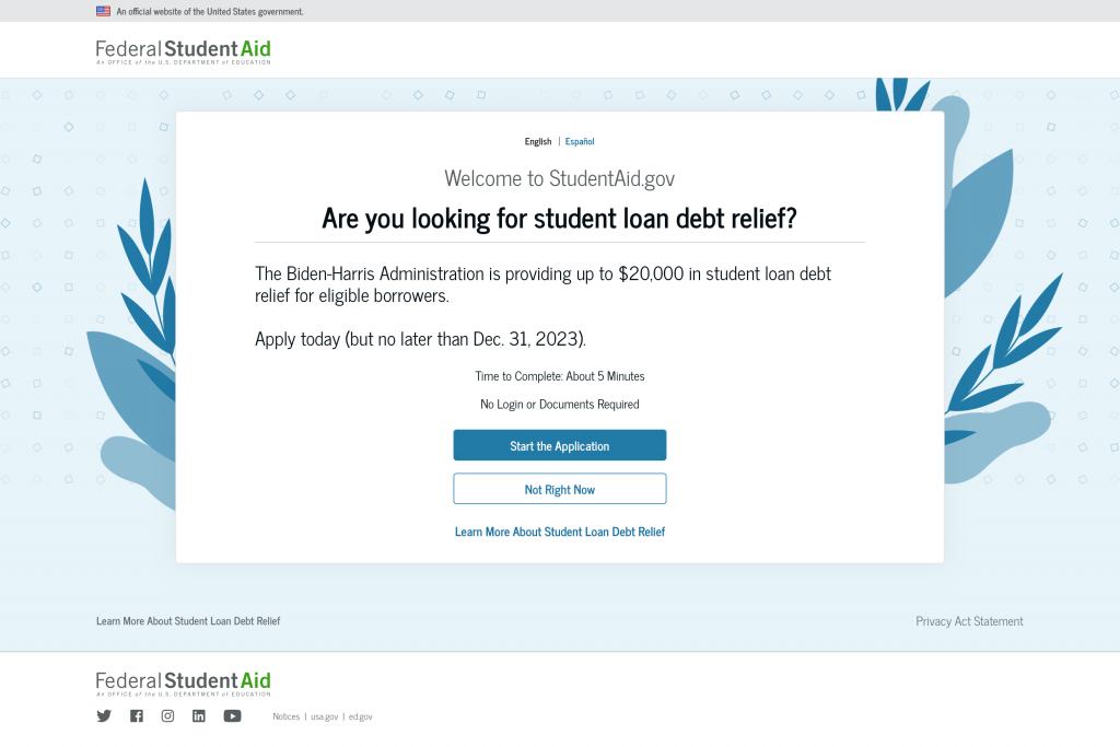
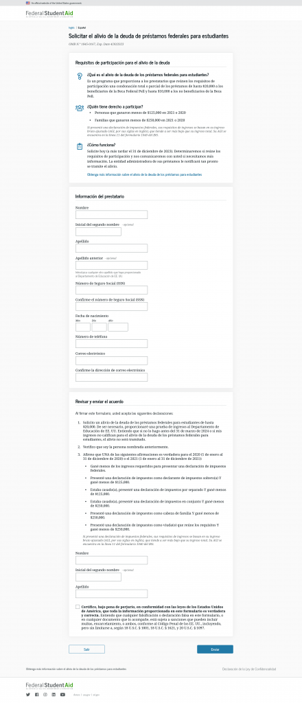
We recruited dozens of student loan borrowers and conducted usability testing in English and Spanish. We learned that some borrowers felt the form was “so easy they thought they missed something.” We were able to tweak some language and helped build out a splash intercept page that we deployed to studentaid.gov.
Results
The form was launched in fall of 2022 during a “beta” period. There were 24 million submissions in the first week. But we were not done refining the user experience.
End to End Experience
In order to ensure borrowers were properly notified about progress we built additional elements into the student loan debt relief process.
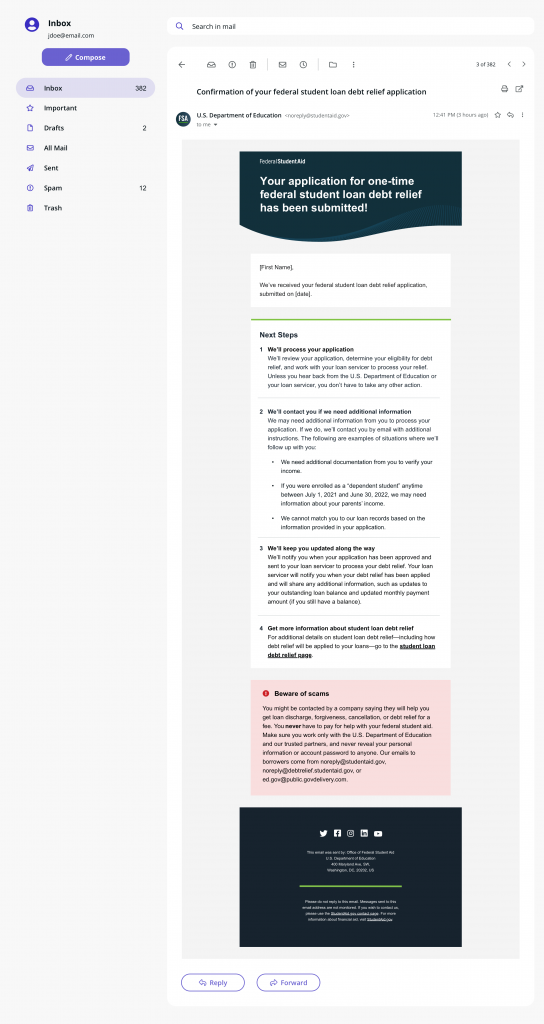
First was ensuring that after each application submission, borrowers got a clear and concise message confirmation email. We tested the language of the next steps with borrowers and revised to improve comprehension and clarity.
Proper Status of Forgiveness Requests
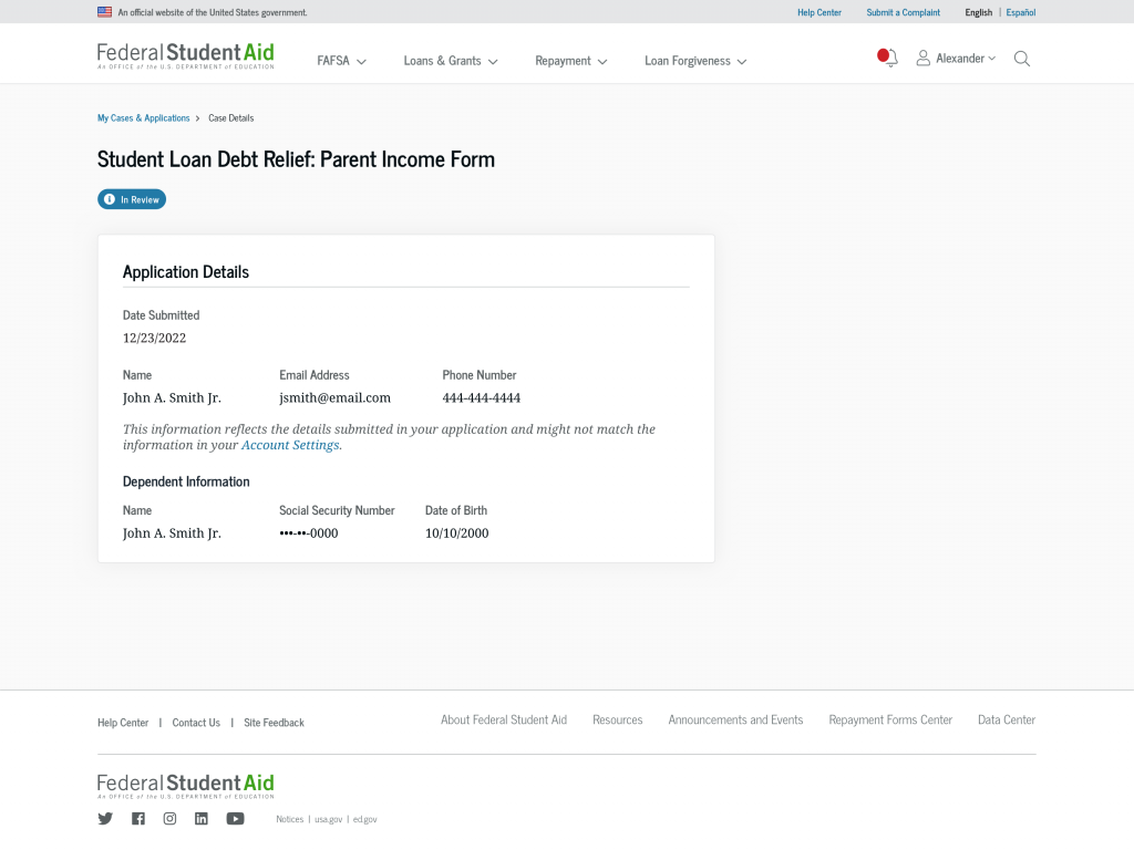
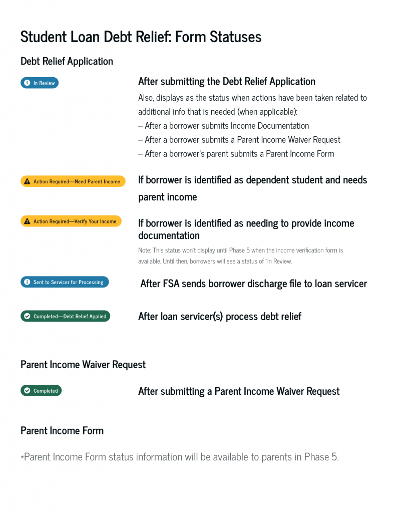
The other element we made sure to build was proper status since we knew it would take a few weeks to process the forgiveness requests and actually have it applied to borrowers accounts. We quickly built an ability for customer service representatives to be able to check application submissions in Salesforce, and we created a plan to launch a “status tracker” for a borrower’s application on studentaid.gov.
Ability to Verify Income if Needed
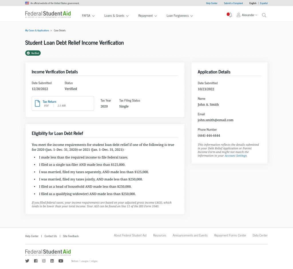
One last piece of the puzzle in the entire service delivery and design of student loan debt relief was to create an easy process for borrowers who were chosen for income verification to be able to easy upload their documentation. The challenge was the initial application was not behind a log in, so we had to connect the application request to a borrower’s account so they could securely upload income documentation.
Lessons learned
- While there wasn’t a lot of time for upfront discovery research we were able to leverage past usability testing on studentaid.gov forms and flows and leverage existing design patterns that had been properly vetted with users.
- Cross team collaboration was critical in the projects success, despite the Supreme Court striking down the program
- Ensuring the application was user tested before launch was initially difficult as folks were nervous about the application leaking to the public, but we ensured testers knew the sensitivity around the form
- Forms don’t need to be complex or even muti-step to be successful. Sometimes people just appreciate how easy something is and this can increase trust and confidence in the system.
- We got some much needed good praise about our efforts!