I was given the opportunity to research and design improvements to a organization-type app that focused on reminders. Using UX research methods and design iteration, I helped to re-think the direction for the app.
The Problem
The ReminderX mobile app was in need of a re-think. The clients wanted to find out what direction the app should take, and ways it can be improved. My role was to help build out a road map for the app based on research. From there, I was tasked with re-designing the app.
Approach
Conversations were held with four separate participants. User interviews helped determine target users and their behaviors, patterns, and goals.
Research areas explored:
- Identifying digital tool (reminder apps, calendars, etc.) usage by participants
- Understanding behaviors of participants in relation to creating lists and setting reminders (note-taking, digital apps, etc.)
- Understanding challenges or limitations of current processes
Additionally, participants offered feedback on the ReminderX app, which helped identify future enhancements and improvements help increase the overall user experience and adoption.
Results
Analysis of the research helped identify findings and recommendations for ReminderX. Based on research, a user persona was developed to help the design process. Additionally, I created design tenets, or guiding principles for the app.
- Keep onboarding simple – many users are currently using Google apps that offer lists or event reminders, which don’t require additional logins or accounts. Where possible, leverage other app’s logins (Google or Facebook) for ReminderX. In general, keep the signup process simple.
- Make information accessible – users expect their information to be stored and saved on the cloud where it’s easily accessed from device to device.
- Allow collaboration to encourage adoption – in the professional world, team’s need to share information effectively, and this includes tasks and reminders for team projects or related disciplines. The app should offer sharing or collaboration features.
- Keep to-do lists flexible – users have a variety of needs when it comes to list types. Certain lists are for short-term related tasks or reminders, like grocery lists, to longer term lists of personal or work-related goals. Additionally, users may just want to create a simple note to jot down ideas. Categories or labels may be important for users to organize lists.
- Think post-it notes – emulate the positive experience people feel while checking off an item on their handwritten lists.
- Allow users to declutter lists – people often make many notes and lists throughout the week, and allowing them to easily organize them is paramount. Archiving of old information should be considered.
- Consider offline use – many users are creating lists for shopping. Lists should be cached or locally saved in the app so in the event of poor reception, lists still load in a store.
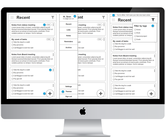
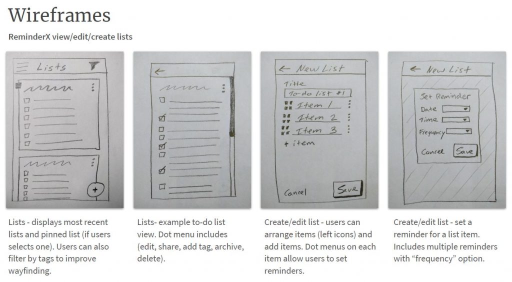
Design and interaction
Using the research findings as a foundation, I started to sketch new ideas about the app’s workflows and task flows. I iterated these sketches and concepts into digital wireframes. From there, I passed the designs along to the development team to build.
Lessons Learned
Sketching can be a really effective method for iterating ideas. It allowed me to not be too worried about how the design actually looked. Instead, sketching kept me focused on the workflows and overall larger picture.