My team and I work on testing the Federal Reserve’s first mobile app geared toward kids in grades K-5. With moderated, in-person usability testing we learned key insights and generated recommendations for improving the prototype.
Problem
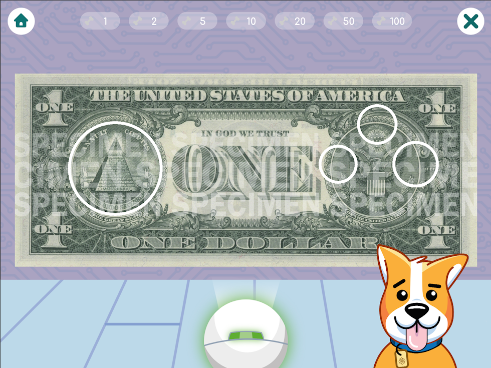
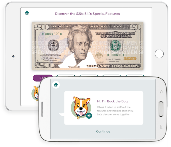
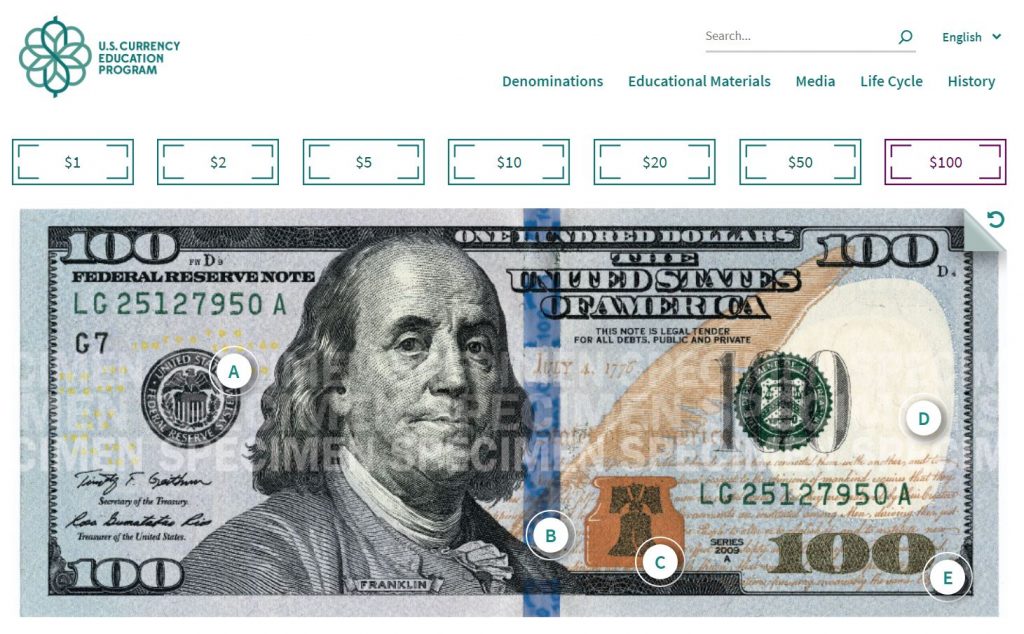
The U.S. Currency Education launched Money Adventure, its first mobile app geared toward educating kids about U.S. currency. The app, which on iOS features augmented reality features, focuses on teaching kids about the different denominations of money. It also helps educate students about U.S. history.
The problem was it wasn’t clear how easily kids were going to be able to use the app’s features as well as understand the content about U.S. history.
Approach
Conduct usability testing and comprehension testing activities with kids.
Our goals were to:
Discover how kids (grades 3-5) use the core features of the app including the augmented reality portion
Uncover any major usability issues
Learn improvements and generate recommendations for the prototype app
Asses how well the content is written for appropriate ages
Results
Kids performed better than expected in regard to the augmented reality portion of the app. Only one student struggled with the feature.
More visual cues were needed to switch between the different currency notes in the AR feature.
The weight of the iPad and ergonomics of it affected the way students used the app. Some felt more comfortable holding the iPad in their laps, which limited how well the augmented reality feature worked. We learned kids have limits for how long they want to hold the iPad.
U.S. history terms were often difficult for students to understand. Differing state curriculums meant some students were exposed to terms others weren’t. We recommended the app can take advantage of this and use it as a way to educate students about U.S. history terms and concepts depicted on the back of U.S. money.
Lessons learned
Logistics surrounding testing with children can be difficult and it’s important to follow all privacy guidelines.
Testing with kids can be tough — they may lose attention or not fully understand the testing activities. Plan for things to go wrong and that’s OK!
I was given the opportunity to research and design improvements to a organization-type app that focused on reminders. Using UX research methods and design iteration, I helped to re-think the direction for the app.
The Problem
The ReminderX mobile app was in need of a re-think. The clients wanted to find out what direction the app should take, and ways it can be improved. My role was to help build out a road map for the app based on research. From there, I was tasked with re-designing the app.
Approach
Conversations were held with four separate participants. User interviews helped determine target users and their behaviors, patterns, and goals.
Research areas explored:
Identifying digital tool (reminder apps, calendars, etc.) usage by participants
Understanding behaviors of participants in relation to creating lists and setting reminders (note-taking, digital apps, etc.)
Understanding challenges or limitations of current processes
Additionally, participants offered feedback on the ReminderX app, which helped identify future enhancements and improvements help increase the overall user experience and adoption.
Results
Analysis of the research helped identify findings and recommendations for ReminderX. Based on research, a user persona was developed to help the design process. Additionally, I created design tenets, or guiding principles for the app.
Keep onboarding simple – many users are currently using Google apps that offer lists or event reminders, which don’t require additional logins or accounts. Where possible, leverage other app’s logins (Google or Facebook) for ReminderX. In general, keep the signup process simple.
Make information accessible – users expect their information to be stored and saved on the cloud where it’s easily accessed from device to device.
Allow collaboration to encourage adoption – in the professional world, team’s need to share information effectively, and this includes tasks and reminders for team projects or related disciplines. The app should offer sharing or collaboration features.
Keep to-do lists flexible – users have a variety of needs when it comes to list types. Certain lists are for short-term related tasks or reminders, like grocery lists, to longer term lists of personal or work-related goals. Additionally, users may just want to create a simple note to jot down ideas. Categories or labels may be important for users to organize lists.
Think post-it notes – emulate the positive experience people feel while checking off an item on their handwritten lists.
Allow users to declutter lists – people often make many notes and lists throughout the week, and allowing them to easily organize them is paramount. Archiving of old information should be considered.
Consider offline use – many users are creating lists for shopping. Lists should be cached or locally saved in the app so in the event of poor reception, lists still load in a store.
Design and interaction
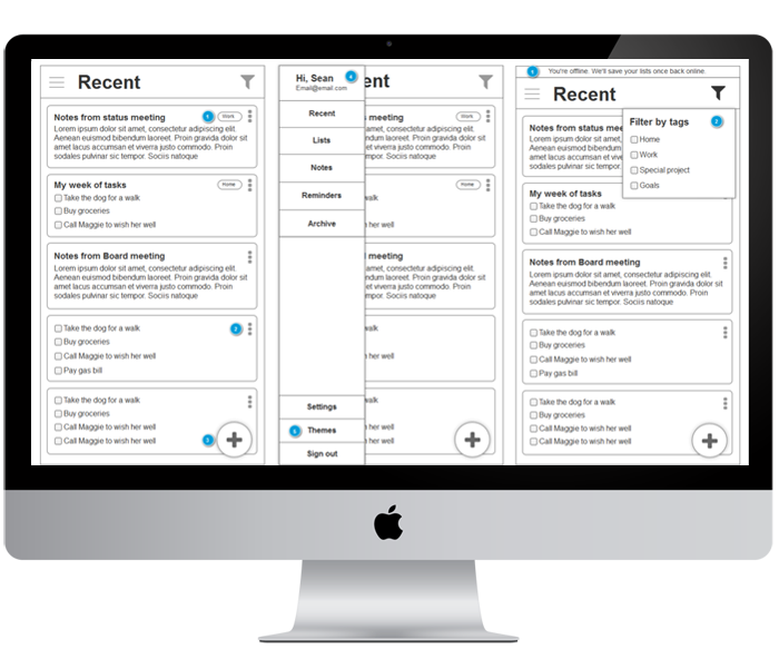
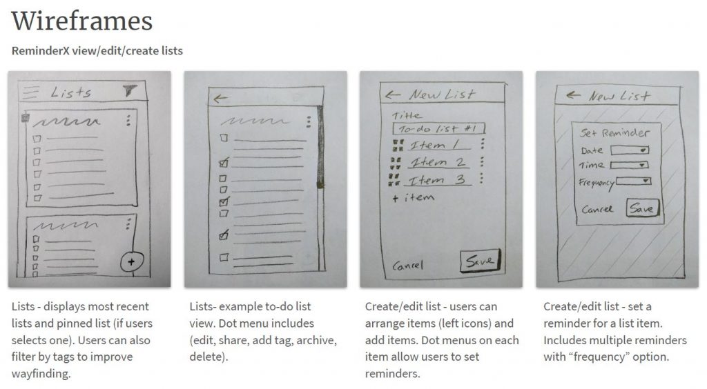
Using the research findings as a foundation, I started to sketch new ideas about the app’s workflows and task flows. I iterated these sketches and concepts into digital wireframes. From there, I passed the designs along to the development team to build.
Lessons Learned
Sketching can be a really effective method for iterating ideas. It allowed me to not be too worried about how the design actually looked. Instead, sketching kept me focused on the workflows and overall larger picture.
Following a user-centered design approach, I conduct research into the D.C. Metro’s customer experience. Through interviews and a competitive analysis, I learned key insights into user behaviors and attitudes, which led to key recommendations on how to improve the payment process.
Problem
WMATA (or Metro) is the transit agency that manages and operates metro rail service, bus service, and paratransit service in the Washington, DC metro area. The bus service and metro service collectively move nearly 1 million people a day throughout the District of Columbia, Maryland, and Virginia. Since 1999, the transit agency has offered a contactless, stored-value smart card for bus and metro payment, similar to the size of a credit card.
Despite some incremental improvements, the system hasn’t been improved in nearly two decades. As this was for a graduate school assignment, I envisioned WMATA had asked me to consult and research what improvements it should adopt for its payment system.
Approach
My research was guided by three main goals:
Identify customer behaviors and usage patterns in relation to the SmarTrip payment system
Evaluate how well the current payment system is matching user needs and goals
Discover new ideas and customer insights that will help WMATA improve the user experience of the payment system as a whole
Main research methods were:
Conducting user interviews with WMATA customers
Performing a competitive analysis of Boston, Chicago, and San Francisco’ transit agencies payment systems
Results
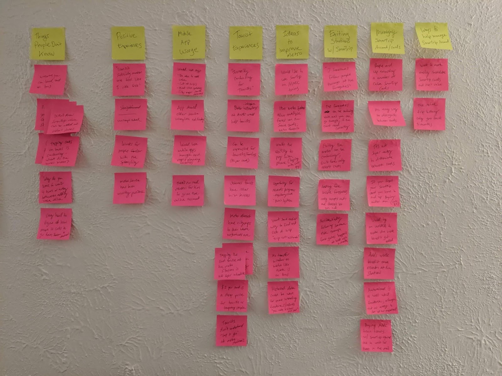
During a thematic analysis, I coded data with an affinity diagramming activity with key insights from user interviews.
Through our user research study, we learned that WMATA’s users were often very satisfied with the metro system overall. However, they felt there are several areas of improvement. Users want more flexible payment options; the ability to pay with your phone, manage your account more easily, have the ability to use one SmarTrip card for more than one person, and want clearer instructions for tourists and new residents. There are also a few things that even life-long riders of metro did not understand — what the different beeps mean when boarding a bus, or that you can reload your SmarTrip card at retail stores across the D.C. area.
While the D.C. metro was one of the first systems to offer a card to pay for service, other transit systems have caught up and surpassed D.C.’s technology and offerings. Chicago’s transit agency offers a more flexible payment system. It allows riders to pay with credit card directly at faregates, Apple or Google Pay, as well as paper tickets and cards like D.C.’s. WMATA has the potential to create a more seamless and efficient user experience across its payment service.
Main takeaways
Overall, users mentioned how pleased and satisfied they were with the metro and bus system, as well as the SmarTrip card to pay for service.
“It’s been positive — it’s useful, the card has never broken and I’ve never had a card that didn’t work” – participant 2
There are number of common things users are often confused about with the payment features and functionality
Users don’t understand the bus payment beeps when boarding and were unaware of the option to reload SmarTrip cards at retail stores and on most buses
The time it takes for value to be active on a card after it’s added online frustrates users, they don’t understand why it’s different than adding value at stations.
Chicago, Boston, and San Francisco’s transit systems are generally more flexible, giving users more options to pay for fares as well as mobile apps to help manage user accounts.
Top recommendations
Seek out technology upgrades that emphasize improved user experiences. Investigate mobile app payment, mobile apps in general, as well as improving the experience going in or out of the faregates.
Improve information and instructions at metro stations to help orient users to the SmarTrip payment program
Investigate feasibility to allow multiple riders per card which would help tourists reduce the upstart cost to ride the system
Consider running advertising campaigns focused on common misunderstandings; what the beeps mean when boarding a bus, the option to add value on a bus, as well as the option to add value to SmarTrip cards at retail stores across the D.C. area
Evaluate station kiosks by conducting usability sessions or direct field observations
Discover how well the online account system works for users by conducting usability testing
Lessons learned
It can be helpful to communicate to stakeholders clear expectations. Exploratory research like this often only brings back high-level themes and additional research questions or opportunities for deeper dives.
If there was more time, conducting a field study at stations and on buses may have been an efficient way to gather customer insights.
As part of a user experience design and research team at the Federal Reserve, I participated in providing UX consulting on the U.S Currency Education Program’s website. The project included a number of activities, but mainly focused on identifying ways to improve the site’s user engagement.
The Problem
The U.S. Currency Education Program (CEP) manages the outreach and education initiatives about educating the public about money. One of the main components of this team is its website, uscurrency.gov.
For this project, I was consulted to help boost the site’s falling engagement and help re-orient the site’s information architecture toward top tasks and users’ main goals. The site had since become larger than when it had launched, which created sprawling navs and unwieldy organization. User engagement was down, and bounce rates kept rising.
Approach
My team proposed a number of different research activities to understand the site’s target audience, top user goals, and ways in which target users group the site’s content. We conducted stakeholder interviews, a heuristic review of the website, evaluated site analytics and past usability studies. In addition, we planned two activities that were focused on the website’s IA.
We started with a card sort (40+ cards) and tested it with more than 75 users using a digital card sorting tool. From there, we focused our efforts on taking a proposed IA and further testing it with a scenario-based tree test, a simple test to see if people can locate information on a website.
Results
We translated our research findings into a proposed IA, which lead the design team to spin up a new main navigation and footer. We incorporated top category names and utilized dropdowns, allowing users greater control. Additional usability findings impacted a few other changes to the site, including breaking out currency by denomination. The site’s bounce rate has since decreased and user engagement is up.
Lessons Learned
Cards sorts can be helpful to generate initial ideas about how users think about the website content.
Tree testing is great method of testing an initial site information architecture; however, scenarios can bias how users answers questions so it’s particularly important to pre-test scenarios before conducting tree tests. Test with colleagues or friends and family.