Category: research
Problem
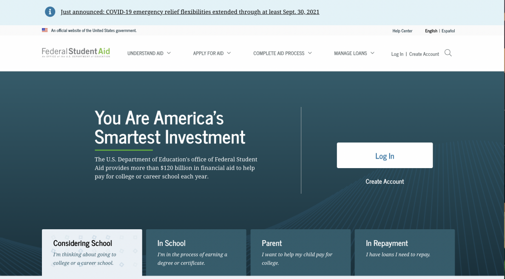
Federal Student Aid, an office of the Department of Education, manages StudentAid.gov, the main website that supports Title IX higher education funding in the country. One of the most visited federal government sites, StudentAid.gov handles more than 20 million FAFSA (Free Application for Federal Student Aid) submissions per year, and supports other relevant tasks like a personalized dashboard with student’s aid summary, digital, self-paced counseling for student loans, and applications for income-driven repayment plans.
Approach
This was the first top-task usability test to be conducted on the production site. Various individual products and features on StudentAid.gov have been usability tested independently, either during design sprints or after release. This was an opportunity to take a holistic view of the site and incorporate more content-based pages.
Our goals were to:
- Evaluate 10 common tasks and scenarios with users
- Uncover any navigation pain points and unexpected issues
- Test on both desktop and mobile devices
- Evaluate the site’s content in context with top tasks on content pages
We tested with a diversity of students, parents, and student loan borrowers in repayment with different incomes, ethnicities, and geographic location across the U.S.
Results
Key Takeaways
- Most users don’t associate Federal Student Aid with the FAFSA. The term FAFSA has much stronger household recognition than Federal Student Aid, despite Federal Student Aid’s efforts to consolidate most of its program sites into one website.
- The site’s main mega-menu on desktops has room for improvement. A lot of users misunderstood categories such as “Manage Loans” which users thought was more personalized to them.
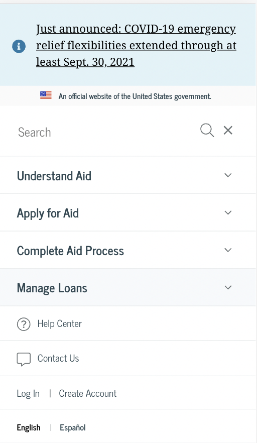
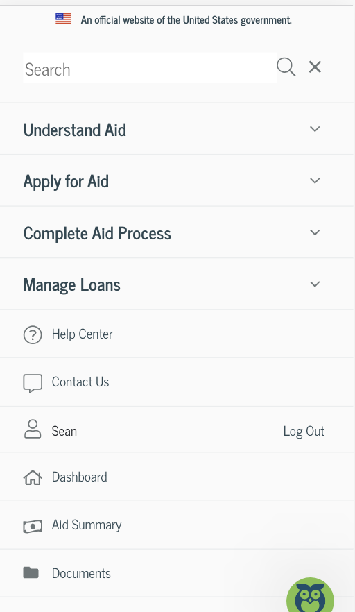
- When users log in, there is a utility menu that appears. Many users didn’t notice it since it was not prominent in the main navigation area and on mobile, it appears below other sections within the navigation.
- Long content pages meant users often hunted and pecked for information, resulting in longer than expected time on task metrics. Very few users used the site search, despite its prominence.
- The mobile website’s navigation proved difficult for users. Many felt the menu was overwhelming and they couldn’t easy find the logged-in pages, such as Dashboard, My Aid, My Docs, and Settings.
Key Recommendations
- Continue mobile testing as part of a core user research approach
- Redesign the in-page navigation for content pages to better support anchor/jump links within the page and to provide mobile users a better experience
- Improve the mobile website’s navigation and consider how the logged-in links interact with the main site’s navigation. Consider a robust, secondary navigation on logged-in pages.
- Conduct a card sort on the site’s main topics to evaluate the site’s information architecture and navigation schemes. Consider condensing the amount of links in the site’s main navigation.
Lessons learned
- Remote testing with mobile devices proved easier than anticipated. Using Microsoft Teams, we were able to easily have participants share their phone screens
- Top-task testing, outside of feature-based testing, is a helpful activity and should be part of any evaluate user research approach. Developing a cadence for this type of testing insures a regular interval for continuous improvement discovery
This website project was part of a grant with a team of five faculty members at James Madison University with a goal of educating the community on health policy. The goal of the initiative is to educate the community about JMU’s health-related civic engagement in the community and the world.
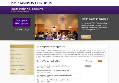
The Problem
As the lead project designer, I worked with various stakeholders to conduct information gathering sessions. While a relatively new initiative from James Madison University — the Health Policy Collaborative had little visibility and lacked a dedicated website.
Approach
I conducted research which included meeting with faculty, nurse practitioners, state policy experts, and local politicians. These meetings and interviews helped get a sense of what the newly formed group, the Health Policy Collaborative, would want to showcase on the website and how the general public would receive the information.
We learned users’s top tasks and goals as well as clear goals from our stakeholders.
Results
After identifying target audiences and developing user personas, I explored an information organization activity, attempting to piece together the various themes and information needs of the site.
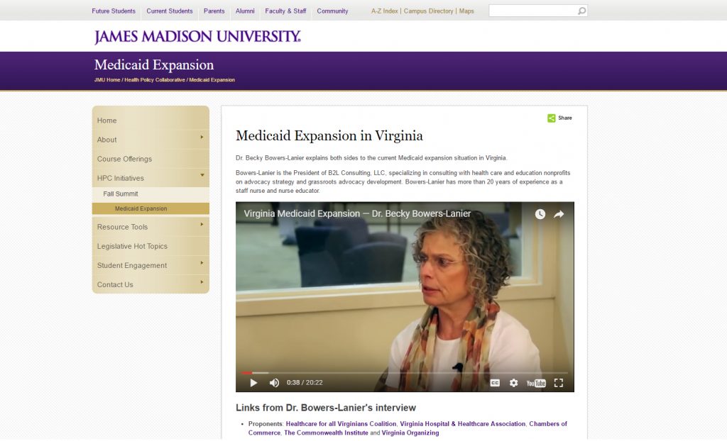
Working inside the JMU content management system was limiting, but we were able to do certain things on the site, like pull in outside news sources. I led an effort to include an interview I conducted with a health policy expert on Medicaid expansion in Virginia.
This relatively short project meant the site’s needs were going to change in the future. My goal for this group was to create them a foundation website, that presented their information clearly and professionally.
This meant creating a information architecture framework that could grow, and not impact the discoverability factor for users.
Considering JMU’s site wasn’t responsive at the time, performance and usability on a phone or tablet still remains an issue.
Lessons learned
- Logistics of scheduling interviews with stakeholders can prolong the time necessary to get information critical for a website.
- Content management systems (CMSs) often have limitations and it’s important to understand the technology behind it in order to not waste time designing something you know will not work.
Usability testing is one of the most useful tools to uncover how well a website is supporting users’ main goals and tasks. Testing can occur anytime during a development of a new system, but it also can be used to discover how well a system is performing; this is often called benchmark usability testing. For the purposes of this testing, we conducted a nano usability test with three users of Marriot.com using the production live website.
Our nano usability test is a great first start to evaluating how well Marriott’s online booking system is working for users. Testing helps to uncover usage patterns, challenges encountered by users, as well as additional research questions. The purpose of testing is to not walk away knowing how to fix every issue with the system. Rather, it’s a first step to understanding where improvements might be made within the online booking system.
To kick things off, we generated three major tasks and recruited three participants.
Task completion
Overall, participants performed well. Only participant 2 had trouble understanding the larger concept of Marriott.com offering different hotel brands within the same booking experience. Users commented that the process felt “easy, and relatively quick” given two users knew a destination and dates they desired. Two out of three commented that they most likely would first compare prices with another travel website like Kayak or Priceline before purchasing.
| Task | Participant 1 | Participant 2 | Participant 3 |
| Select destination, date and details | Completed | Completed | Completed with difficulty |
| Select hotel | Completed | Completed | Completed |
| Select room | Completed | Completed | Completed with difficulty |
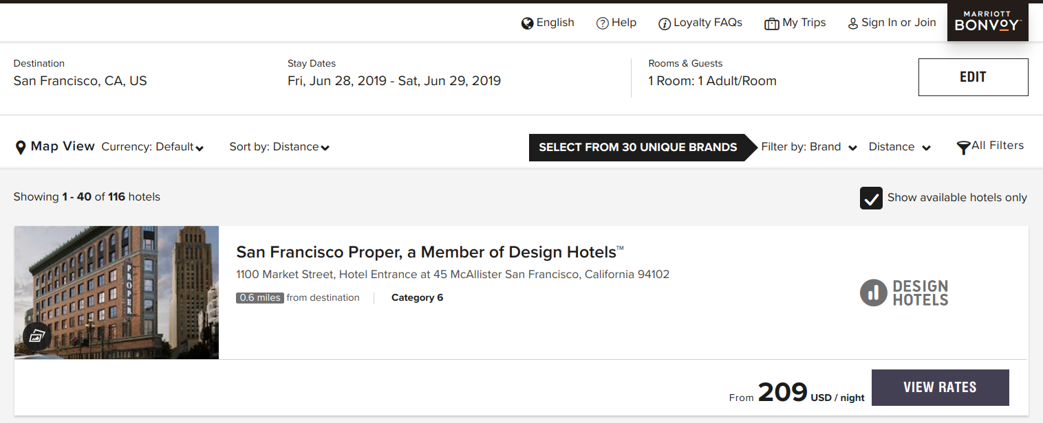
Participant 1: Had very little trouble picking a destination and dates from the main homepage. On the results page, they noted they liked how different hotel chains within the Marriott brand were displayed, but they couldn’t find a way to sort by price, a filtering option they often like to use. On the room selection page for the Park Central Hotel in San Francisco, they said they liked the different price options, and the prepay and save would be a feature they’d use. Often, they would pick the cheapest room option.
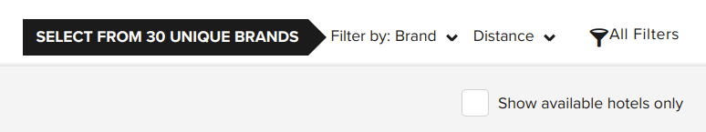
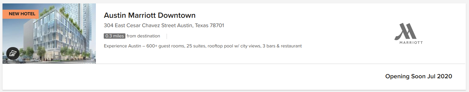
Participant 2: This user was using a smaller laptop and didn’t initially see the homepage call to action booking feature. They selected “Find and Reserve” which dropped down the same selections to pick a destination and date. Once they searched for Austin, Texas, on the results page, the user was briefly confused as why there were multiple hotel brands displayed. “I guess Marriott must own them,” the user questioned. Another thing the user noted on, was why the the results list showed hotels not available on the dates selected. They noticed a checkbox that filters to hotels available, but was confused why that wasn’t the default option. They selected a downtown Austin hotel and selected a prepay room; although commented on how long the title of the room was.
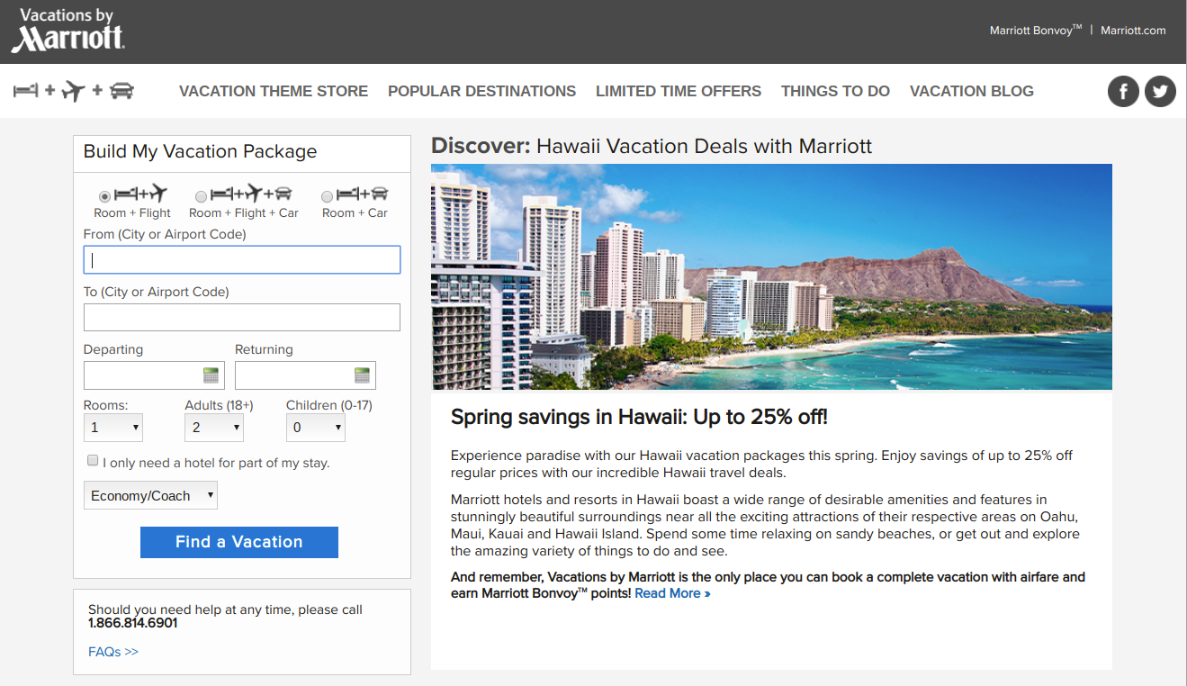
Participant 3: This user didn’t have a destination in mind, so they selected the Deals and Packages page, and selected the Hawaii vacations link. The system sent the user to the vacations by marriott site, a separate site with a different booking experience. On this page, featured hotels were listed but with no price. The user selected the first option, then was prompted to input a date and departure city. Once the list of results was returned, the user selected the first option for the king room. While they successfully booked a room, albeit through the vacations website, they did ask “Am I on the right site? Did I do this right?”
Main findings: user challenges
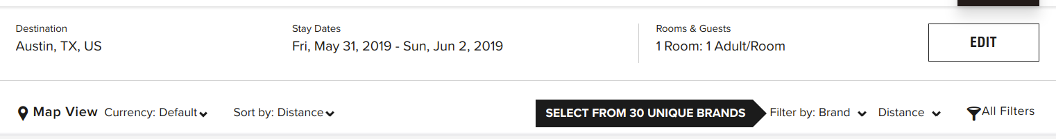
- Finding an option to sort by price was difficult
- Participant 1 had difficulty finding an option to sort the list of hotels by price, which doesn’t appear to be an option within the results page. Sorting by price is a common organization scheme that most travel sites offer. On the results page, the default scheme is to sort by distance.
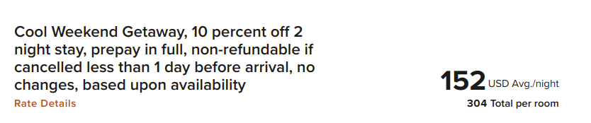
- Deciding on a room type took special care, since the room’s titles are often long
- While choice is often good for users, too much can overwhelm them. In this case, selecting a room at a particular hotel was somewhat difficult. This was due to the fact that hotel rooms have long titles, with a strong font that makes it difficult to read. This can increase users cognitive load and easily lead to frustrations. One room for a Courtyard Marriott was titled, “Cool Weekend Getaway, 10 percent off 2 night stay, prepay in full, non-refundable if cancelled less than 1 day before arrival, no changes, based upon availability” in a large, bold font.
- The Marriott vacations experience is completely separate from the main Marriott.com booking experience
- One user that didn’t have a destination in mind selected the deals section of the website. After browsing about Hawaii, they were taken to the Marriott Vacation website, a separate experience that had a different look and feel. This separate site may confused users and there wasn’t any indication that you were leaving the main Marriott site.
- The hotel results list often included hotels not available or coming soon
- Even though a user selected dates for a trip, the results page often displayed hotels that were not available or “opening soon.” The option to display only available hotels was not selected by default. Showing all hotels in the list may be helpful for someone that is browsing, but could be frustrating to someone that knows the dates they want to travel. More results in the list means more items users have to scan through, which can increase cognitive load.
Additional user research questions
Our test stopped at the payment section and was narrowly focused only on the booking process. Since we were running a quick nano usability test, we didn’t have time to prepare fake information to use in the payment step. However, this is a critical step that deserves to be tested in the future. In addition, further research questions may surround:
- What additional challenges are encountered by user attempting common tasks on Marriott.com? Tasks could include:
- Changing or canceling a reservation
- Signing up for loyalty program/credit card
- Contacting customer service
- What substantial usability impediments exist? (items that may influence a user to abandon the website or booking process)
- What are additional customer insights that may help Marriott’s digital strategy?
One of the most important next steps is to ensure Marriott’s website has clearly identified and measurable goals. Understanding Marriott’s goals and business strategies will help determine research activities to further improve Marriott’s digital products.
Conclusion
Conducting user research helps designers conceptualize systems and processes that match how users think. Designing an experience that just plain works well doesn’t happen with luck. Through proven research methods and user engagement, organizations can build products with users, rather than “for” users. Involving users in prototyping, development, and testing, is a necessary step that helps give a product a higher chance of success.
As demonstrated with the nano usability test, research doesn’t have to be a long, drawn-out process. With only three users, we were able to quickly identify areas of the booking process to explore. This quick testing method gave us insights that we didn’t have before. Testing often allows a continuous check-in on how a design is performing and gives organizations insights into how to improve their products. Research is a great way to ensure designs match user expectations. Any form of research, big or small, assists with improving the user experience for users and helps to align digital products with the goals of an organization.
Categories
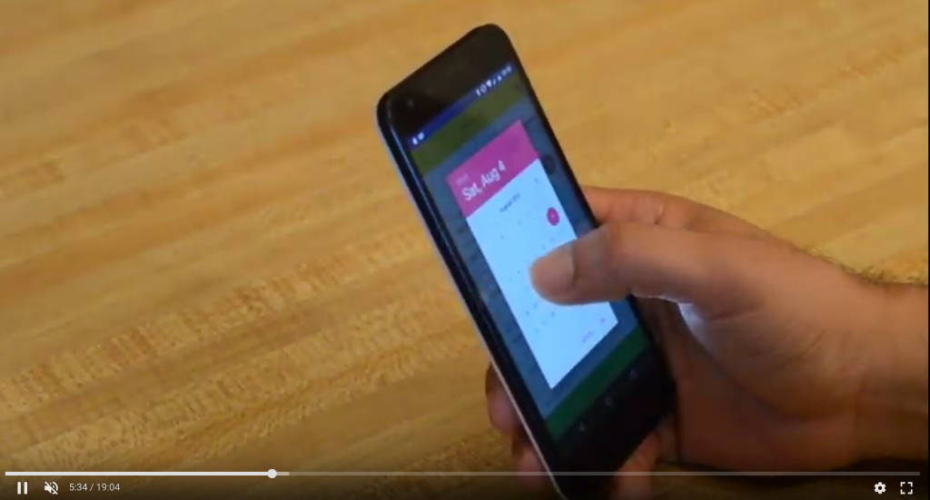
Brightline App Mobile Usability Testing
Brightline is a new high speed train service in Florida. We were tasked with testing the booking app and related top tasks. Using moderated in-person usability testing, we recruited nine participants and generated a findings and analysis report based on our analysis.
The Problem
We wanted to conduct usability testing to identify potential improvements for the booking app.
Our research goals were to:
- Observe user patterns and behaviors as they attempt a set of common tasks using the mobile application
- Identify how easily users accomplish common tasks
- Understand users’ experiences and expectations as they work with the app
- Gather user attitudes and perceptions as they relate to this type of booking app
Approach
Our formative usability study followed the “think aloud” protocol by asking test participants to describe their thoughts as they attempted to complete three separate tasks. We recruited nine participants for this study. We used a moderated in-person testing method.
Results
- Each video was observed, which helped surface patterns and themes based on how users navigate the app and attempt the tasks.
- From the initial observations and findings, themes were sorted and given prioritization based on frequency of the issue and other qualitative feedback. Post-test questions also help to influence the findings.
- We then developed recommendations that address several of the findings.
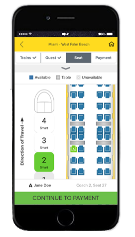
Main takeaways:
- The booking process is clear and the app gives users a straightforward entry point to begin booking a trip.
- The app’s overall performance and technical issues can easily frustrate users.
- Aspects of the seat selection task in the booking process has room for improvement.
Lessons learned
- Usability testing on mobile apps can be difficult to see how a user is interacting with the app. Having a way to record the phone screen or video record the phone is important so you can later view how the user is interacting with the app.
- If possible, make users comfortable and allow them to use their phone. If they are not comfortable downloading an app, have a backup phone ready for them to use. People are often the most familiar with their own devices.
- Probing users to “think aloud” is an important reminder when conducting in-person moderated usability testing.
Categories
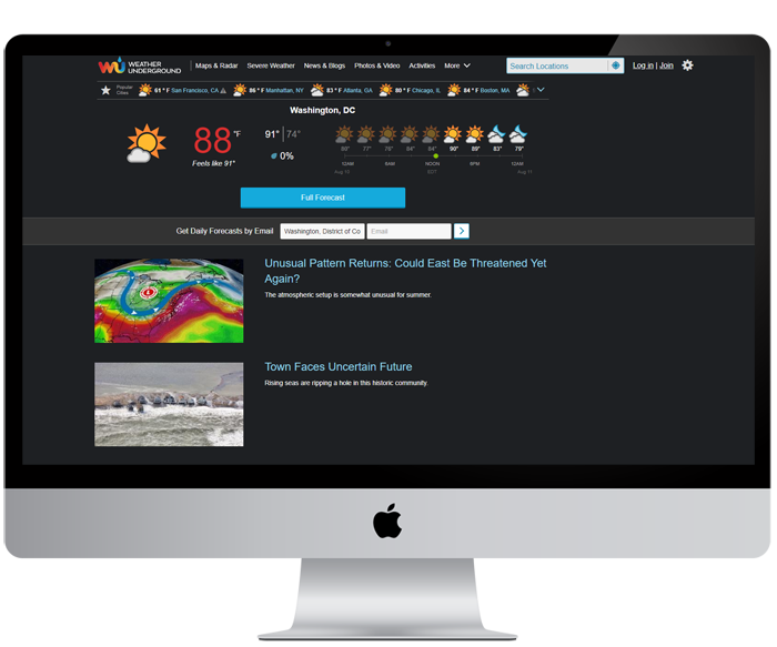
Weather Underground Usability Testing
I conducted remote unmoderated usability testing for the Weather Underground website. We tested top tasks on the site and gained user insights into how well the site works for them.
The Problem
We tested Weather Underground’s website based on common tasks with the intention to see how well the site performs.
Our research goals were to:
- Observe user patterns and behaviors as they attempt a set of common tasks
- Identify how easily users accomplish common tasks
- Understand users’ experiences and expectations as they work with the website
Approach
Our formative usability study followed the “think aloud” protocol by asking test participants to describe their thoughts as they attempted to complete three separate tasks. We recruited five participants for this study. We used an unmoderated remote testing service called Validately, which recorded participants screens and audio. Four out of five testers check the weather regularly.
While five participants may appear small, most common usability issues can be identified with a small sample since we are more focused on qualitative feedback and general experiences.
How we analyzed the data:
- Each video was observed, which helped surface patterns and themes based on how users navigate the website and attempt the tasks.
- From the initial observations and findings, themes were sorted and given prioritization based on frequency of the issue and other qualitative feedback. A set of questions were asked after the test, which also influenced the findings.
- Using the findings, we developed recommendations or identified further areas of research.
Results
Main takeaways include:
- Users easily found a way to find local weather forecasts.
- Navigation groupings and labels confused users for two of the tasks.
- The website features large ads that can affect how users find information and use navigation.
- Static content pages and their organization could be improved.
Lessons Learned
While unmoderated remote usability testing offers an efficient way to test, its not as personal as in-person and you may have to test more remote users due to technical issues encountered during testing.
Public libraries serve an important community role. Having a website and services that work well for people helps libraries meet their missions. I researched how users want to use a library website and generated ideas and recommendations on how to improve a local library site.
The Problem
As it was understood, the current Billings Public Library’s website had grown over the years and information became increasingly difficult to find. The site’s organization schemes and structures didn’t appear to be working and wasn’t supporting users’ key tasks. With focused research, iterative design and clear communication, we’ve developed research and design artifacts that will help improve the site and focus it more on users’ main goals.
This project was for a graduate school assignment.
Approach
Conversations were held with librarians at the downtown branch of the Washington, D.C. Public Library. User interviews helped determine target users and their behaviors, patterns, and goals.
Our research goals were to:
- Identify target users
- Learn about users goals and top tasks on library websites
- Understand user challenges or limitations
- Identify any content holes or enhancements to the site
In addition to interviews, we conducted research into other library websites, industry research around best practices and common uses, and UX case studies on library website projects.
Results
What we learned about users
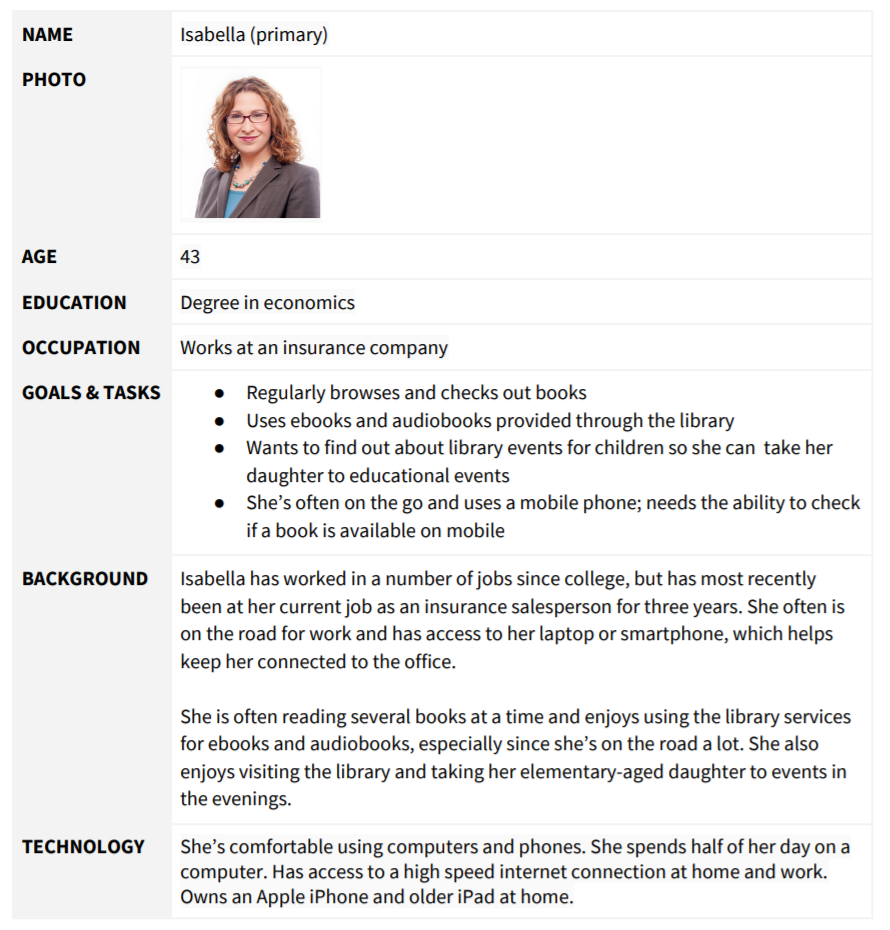
Library websites are used by a variety of audiences, and our four personas describe likely library site users. (see detailed personas on the next page)
- Isabella the mother who leads a busy life but enjoys reading and listening to audiobooks.
- Wayne the retiree who uses the library as a community meeting space.
- Lisa the student who likes to read and use library computers to do homework.
- Martin the new resident that wants to learn about the local library.
What users want to do
Based on our research, users top priority tasks are to:
- Browse or find a book
- Place a hold on a book
- Find an ebook or audiobook
Following the primary tasks, the site needs to easily support users that want to:
- Reserve a conference room
- FInd out when the library is open
- Find out how to get a library card
- FInd out about events
- Look up a specific class offering
- Find out information about volunteering
Task priority: by primary and secondary personas
| Isabella (P) | Wayne (P) | Lisa (S) | Martín (S) | |
| High Priority Tasks | ||||
| Browse or find a book | Yes | Yes | Yes | |
| Place a hold on a book | Yes | Yes | ||
| Find an ebook or audiobook | Yes | Yes | Yes | Yes |
| Medium Priority | ||||
| Reserve a conference room | Yes | Yes | ||
| FInd out when the library is open | Yes | Yes | Yes | |
| Find out how to get a library card | Yes | Yes | ||
| FInd out about events | Yes | Yes | ||
| Low Priority | ||||
| Look up a specific class offering | Yes | |||
| Find out information about volunteering | Yes |
recommendations
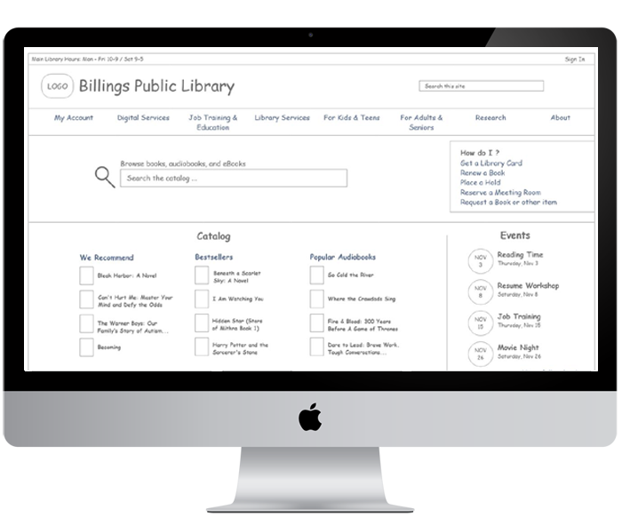
There are a number of ways to organize and classify information on a website. In the case of the Billings Library, using an ambiguous organizational scheme with both audience and topical schemes will support users in finding key information and offer a simple way to navigate through the website.
Considering the current site uses an audience scheme to segment certain content for seniors, adults, teens, and children, continuing an audience based scheme works because content is very audience specific. However, we’ll combine Teens & Children and Adults & Seniors into two groups.
The rest of the information on the site fits nicely into a topic-based scheme, based on several key categories. The proposed main categories for the Billings Public Library navigation:
- My Account
- Digital Services
- Job Training & Education
- Library Services
- Research
- About
- For Kids & Teens
- For Adults & Seniors
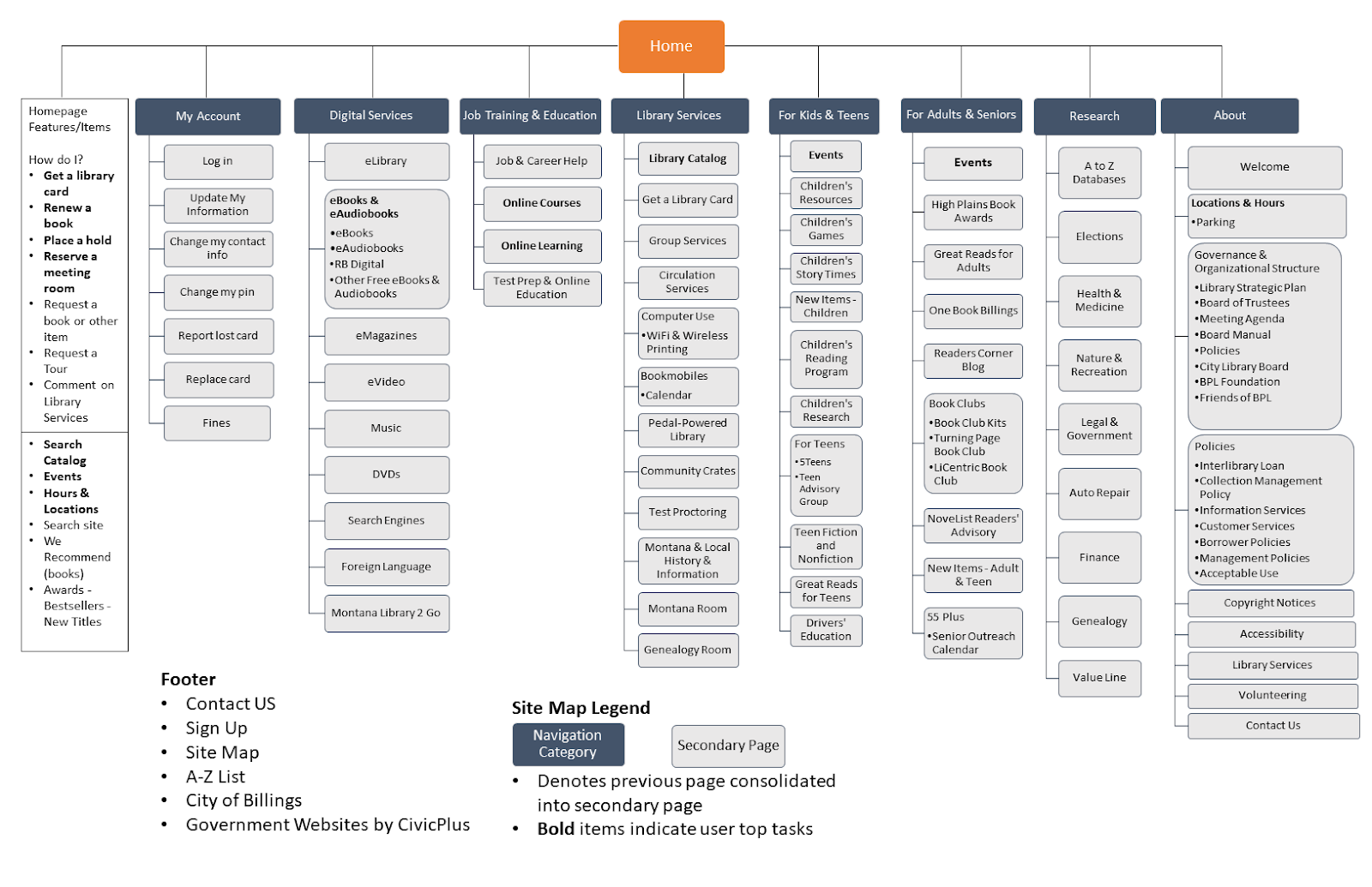
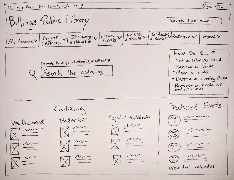
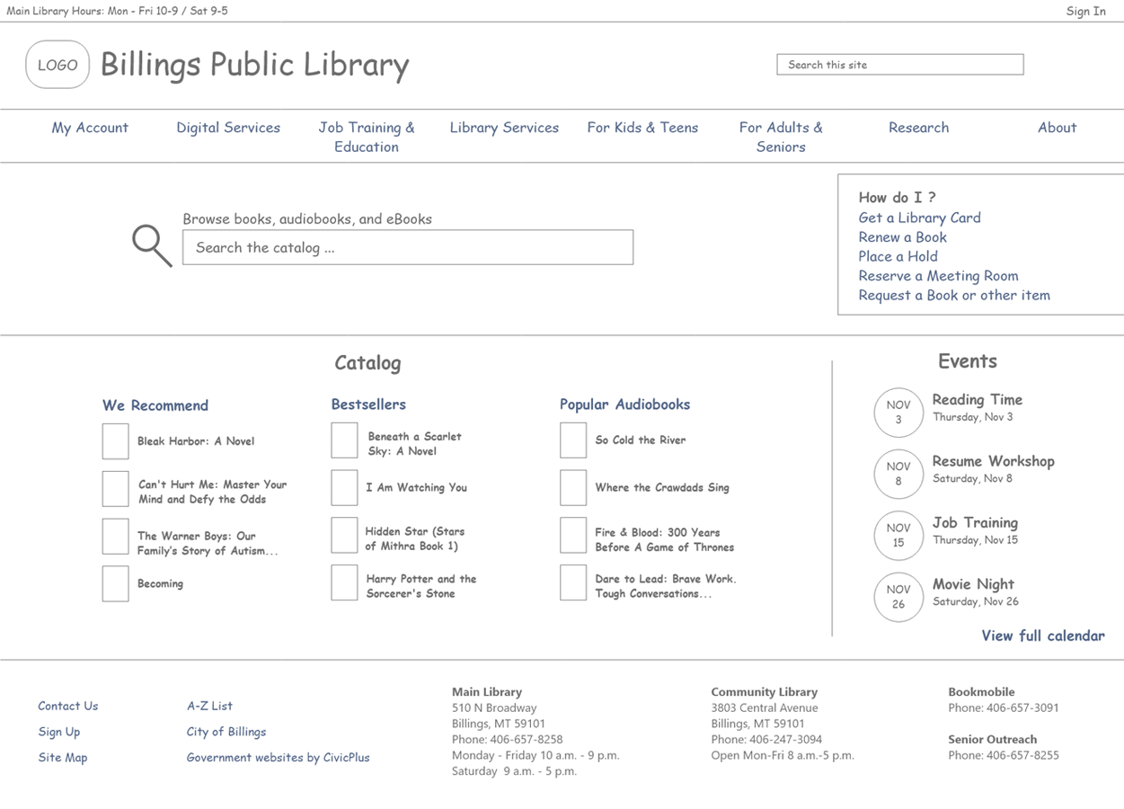
Homepage Features
In addition to the new navigation, enhancements to the homepage will help promote the site’s primary tasks discovered during research.
- “How do I feature,” which lists common how-to tasks (get a card, renew a book, etc.)
- Hours and Locations
- Browse the catalog
- Site search
- Events
- Featured books (We Recommend, Awards, Bestsellers, New Titles
Lessons learned
- The value of content audits can not be overstated. They help you identify what types of content you currently have on your site and can help reduce the content on your site.
- Complex site maps can be difficult to make but are an important artifact to communicate your site’s information architecture to key stakeholders.
Categories
Marriott Booking Process Research Study
Hotel bookings in the age of Airbnb — I look into how the Marriott Bonvoy consolidates nearly 30 brands of hotels under one site and what the user experience of the booking process is like. With UX research, I find discover insights into the booking process as well as recommendations for Marriott to improve its overall digital strategy.
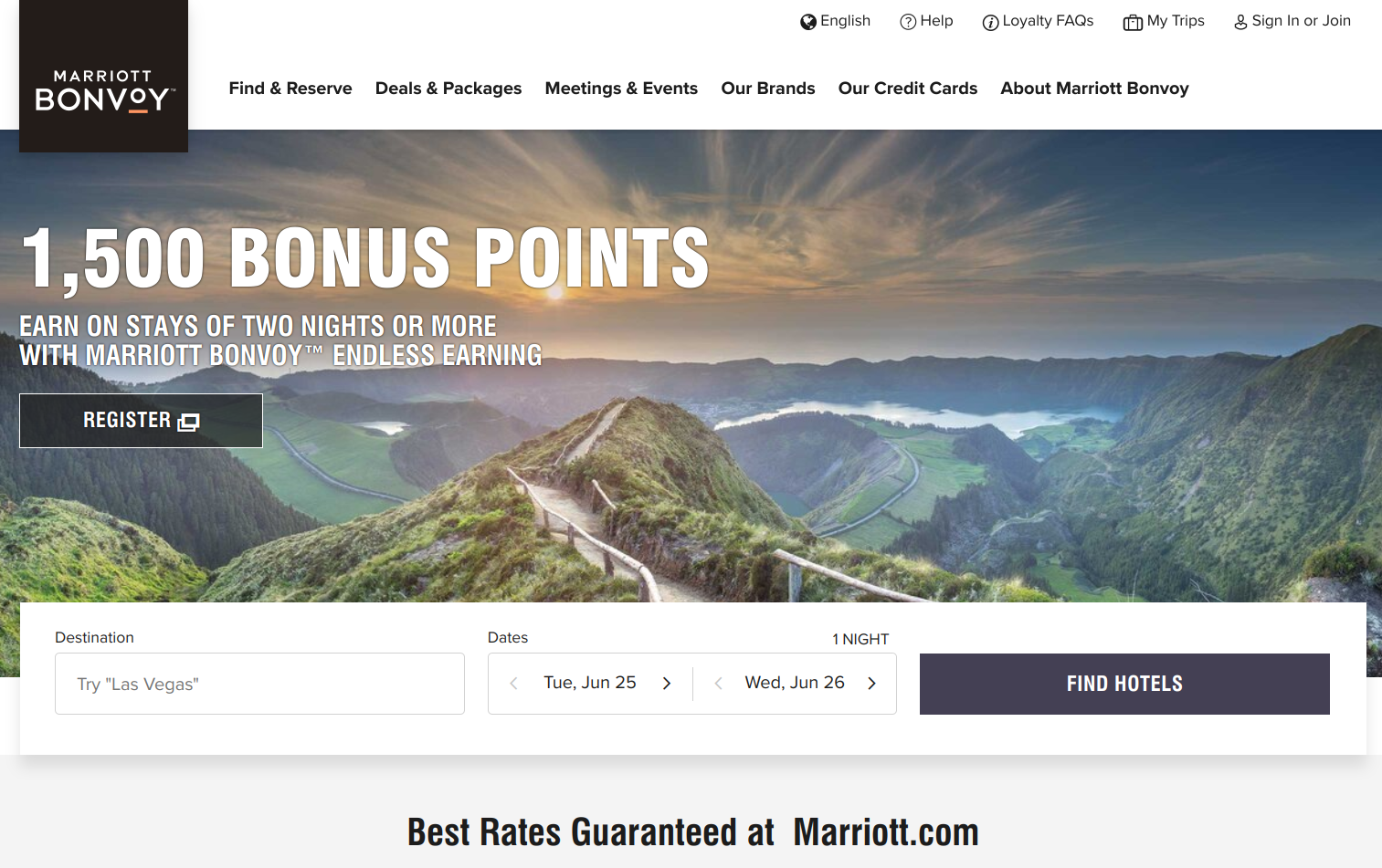
The Problem
As part of a user research study for graduate school, I investigated the Marriott Bonvoy’s booking process and overall customer experience with the web-based booking process and Bonvoy rewards program.
Driving the user research was clearly identified business goals
- Increase hotel bookings via digital properties by 10%
- Increase reservations for their Luxury and Lifestyle Collection hotel categories
- Gain 10,000 incremental members of the Marriott Rewards loyalty program in the first quarter after the redesign
- Decrease by 20% the number of people starting and then abandoning a reservation
- Increase by 5% the number of people choosing a hotel and flight package (vs. just booking their hotel alone)
Approach
Our research goals were broad and designed within the context of the Marriott redesign project. Not only were we curious about how users interact with Marriott services, but we were also interested in more about how the public travels, uses travel sites, and rewards programs.
Research goals:
- Understand user patterns, processes, and challenges in booking a hotel room through a digital service
- Discover customer satisfaction and opinions of hotel loyalty programs
- Understand user usage patterns of desktop/mobile sites vs. smartphone apps for travel related services and information
- Learn about customer attitudes and behaviors toward booking more than just a hotel room (airfare, etc.)
We conducted user interviews with target users. In each interview, we asked a series of questions relating to booking travel, rewards programs, device usage, and vacation packages.
About the participants
- Our three participants ranged from late 20s to early 60s
- All participants travel and stay in a hotel at least 3-4 times a year
- Only one participant regularly books travel through Marriott.com; same participant has Marriott’s app
- All participants have some sort of travel app on their phones, and use their phones regularly to manage travel bookings
Results
The recordings and notes from the three user interviews were analyzed using summarization and deconstruction methods. Summarization involves collecting similar observations from the interviews. Generalization involves taking specific insights from the interviews and applying them as larger statement to form a research finding.
In total, 13 major themes emerged as well as subsequent recommendations. Our initial research provided useful insights into user behaviors, attitudes, and goals.
Booking hotels
- Location of hotel in relation to city attractions is often an important factor when picking a particular hotel. Other items users mentioned: free wi-fi, breakfast options, on-site restaurant or coffee shop
- Users who may appear to “abandon” their hotel bookings are most often conducting research for their trip and not yet ready to reserve a room.
- Third-party travel sites like Expedia are often used and trusted for booking travel arrangements. Better deals and clear methods for customer service were noted as reasons users prefer these sites.
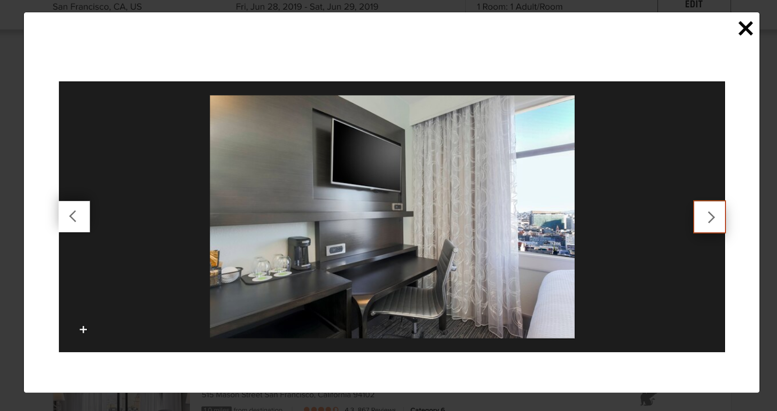
- Hotels generally don’t do a great job at being transparent about room type; photo displays of hotels are often more focused on the business traveler and not the leisure traveler
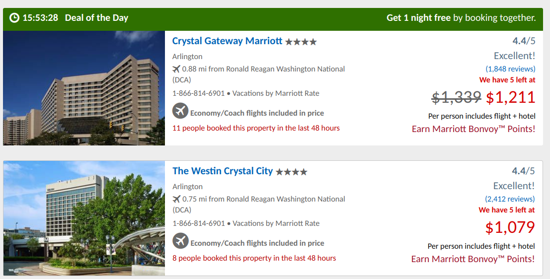
Vacation packages and deals
- Vacation packages and deals are not widely used; many feel they are not great value or find it too difficult to determine if they actually save you money
Hotel rewards programs
- A loyal Marriott rewards member feels as though Marriott keeps “upping the ante,” making it more difficult to redeem points and free night offers
- “[Marriott is] making you jump through hoops to redeem a free night for the credit card offering”
- The Marriott Bonvoy app can be helpful for rewards members to quickly check point values and look back at old trip itineraries
Mobile apps and usage
- While mobile usage is increasing, users noted that for complex trip planning and comparisons they prefer to use a laptop with a larger screen
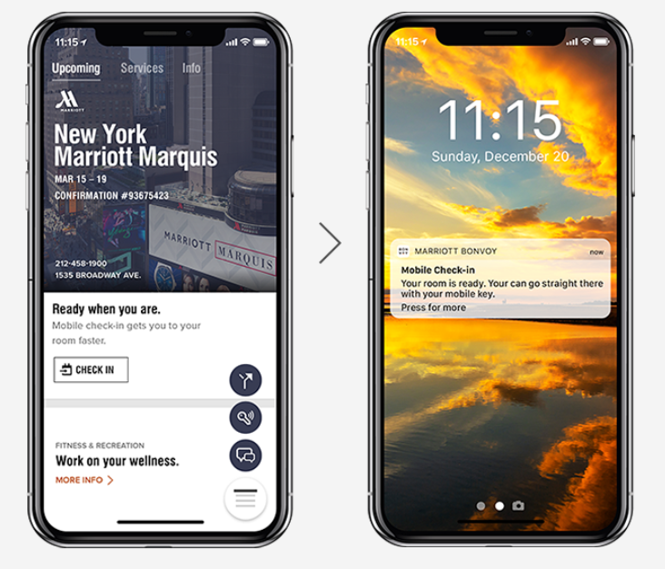
- Mobile check-in is not a commonly used feature; most prefer to check in at a counter with a person
Hotel rewards programs
- Simple perks like free water at check-in for Marriott rewards members can go a long way to demonstrate customer appreciation
- Loyalty reward programs are widely used but many feel as though they never reap benefits from them; often don’t travel enough to get any perks
- Infrequent travelers feel as though the rewards programs aren’t designed for them; although still would be willing to sign up for one that gave them benefits
Hotels vs. Airbnb rentals
- Hotel rooms often don’t feel as good value as larger accomodations found on Airbnb. Group travel or families looking for a hotel suite often feel priced out of a hotel and will instead look at renting an apartment or house. Hotels don’t do a great job catering toward this market.
RECOMMENDATIONS
Further research may be required, but there are some key recommendations that could be addressed now. These are not in any particular order and some may be more complex than others.
- Explore the concept of better advertising cost of vacation packages so that users can quickly identify its “value” in comparison to traditional booking costs
- Identify non-frequent traveler rewards perks and better communicate them to travelers. This may help increase sign-ups and usage of these reward programs.
- Add option to filter by price when users are browsing for hotels
- Conduct a content audit of imagery used throughout hotel brands; ensure image selections are designed for the average traveler (more photos of room types, less of conference rooms spaces)
Consider integrating the map view of hotel listing more prominently to support users trying to select a hotel in a particular area of a city. Support users picking a hotel near local attractions.
Additional research activities
In addition to the exploratory research and related findings, I recommended further research studies.
- Conduct a comparative analysis of competing hotel brands’ apps and services to better understand their offerings and features.
- Perform more extensive usability testing with users that are familiar with the Marriott brand to discover current customer behaviors, opinions, and attitudes.
- Perform a card sort or tree test to see how well the current site structure and app structures match how users think about the information.
Lessons learned
- Remote interviewing can be prone to technical difficulties that can affect the quality of information you collect
- Having a script and moderation guide can greatly assist in conducting user interviews and helps you stay consistent with the information and questions asked of participants
- Developing pre-research assumptions (or hypotheses) is a method of guiding your research to either validate/in-validate an assumption. Collecting these from stakeholders can make the process participatory.
Categories
Money Adventure Mobile App Testing
My team and I work on testing the Federal Reserve’s first mobile app geared toward kids in grades K-5. With moderated, in-person usability testing we learned key insights and generated recommendations for improving the prototype.
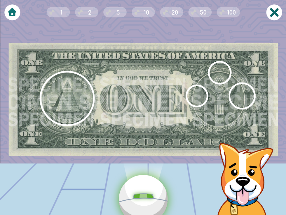
Problem
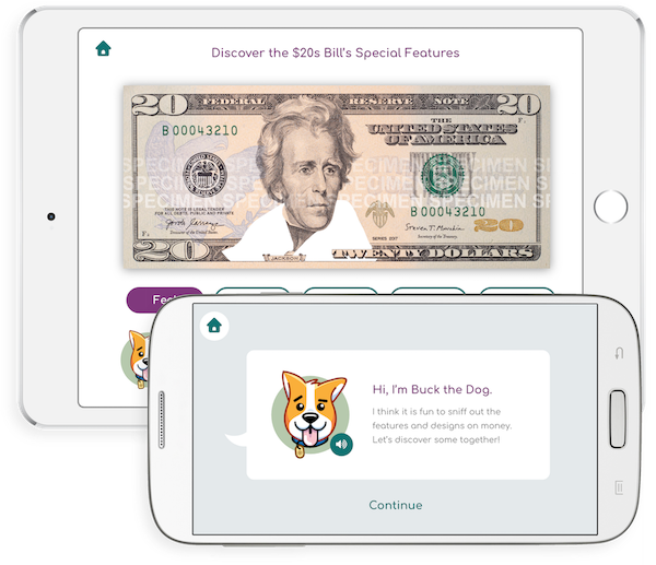
The U.S. Currency Education launched Money Adventure, its first mobile app geared toward educating kids about U.S. currency. The app, which on iOS features augmented reality features, focuses on teaching kids about the different denominations of money. It also helps educate students about U.S. history.
The problem was it wasn’t clear how easily kids were going to be able to use the app’s features as well as understand the content about U.S. history.
Approach
Conduct usability testing and comprehension testing activities with kids.
Our goals were to:
- Discover how kids (grades 3-5) use the core features of the app including the augmented reality portion
- Uncover any major usability issues
- Learn improvements and generate recommendations for the prototype app
- Asses how well the content is written for appropriate ages
Results
- Kids performed better than expected in regard to the augmented reality portion of the app. Only one student struggled with the feature.
- More visual cues were needed to switch between the different currency notes in the AR feature.
- The weight of the iPad and ergonomics of it affected the way students used the app. Some felt more comfortable holding the iPad in their laps, which limited how well the augmented reality feature worked. We learned kids have limits for how long they want to hold the iPad.
- U.S. history terms were often difficult for students to understand. Differing state curriculums meant some students were exposed to terms others weren’t. We recommended the app can take advantage of this and use it as a way to educate students about U.S. history terms and concepts depicted on the back of U.S. money.
Lessons learned
- Logistics surrounding testing with children can be difficult and it’s important to follow all privacy guidelines.
- Testing with kids can be tough — they may lose attention or not fully understand the testing activities. Plan for things to go wrong and that’s OK!